Decision 01
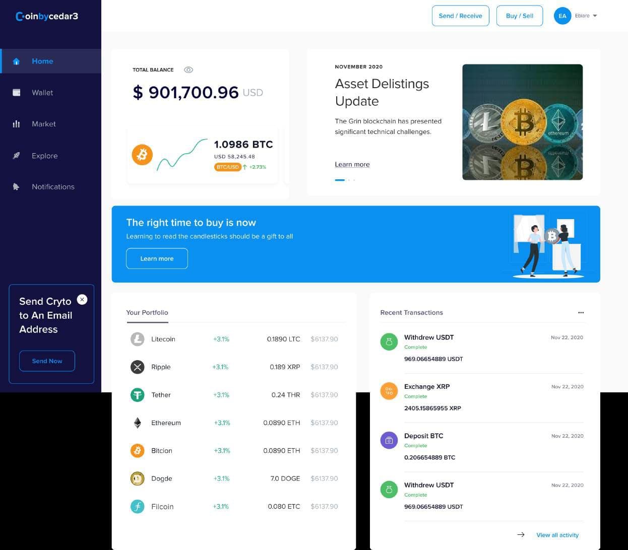
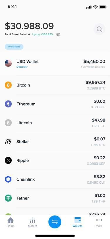
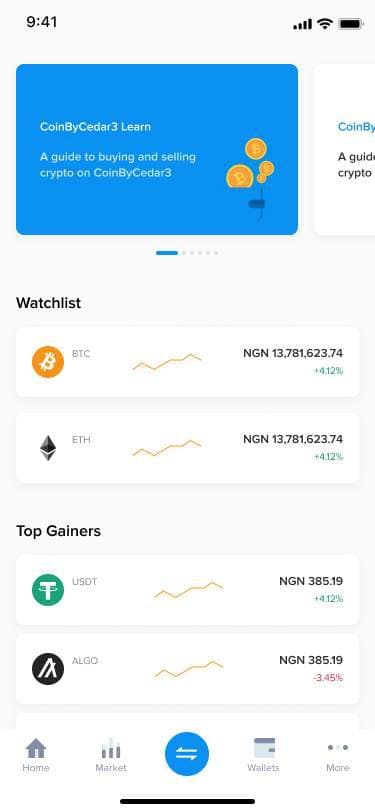
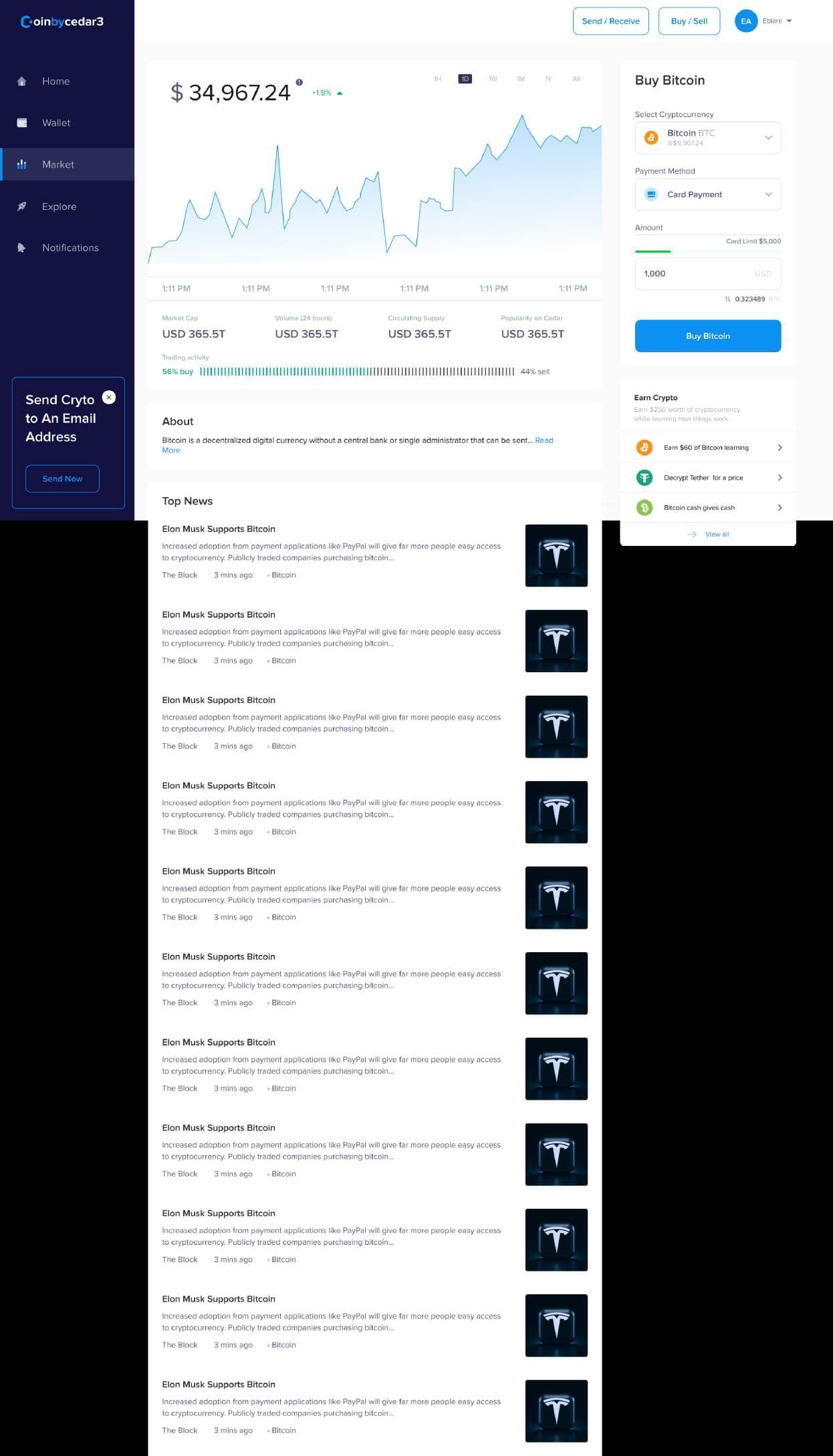
One balance, then the detail
Portfolios across many coins are hard to read.
- What we chose
- A wallet that shows the total balance first, with each coin’s balance below.
- Why
- Answers ‘how am I doing?’ before ‘what do I hold?’.
Coinbycedar3
Problem & context
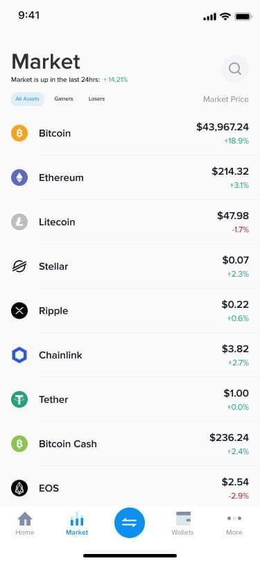
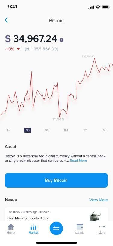
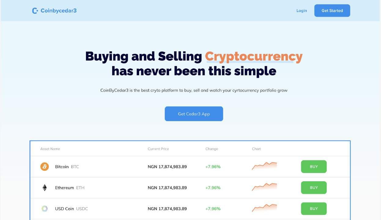
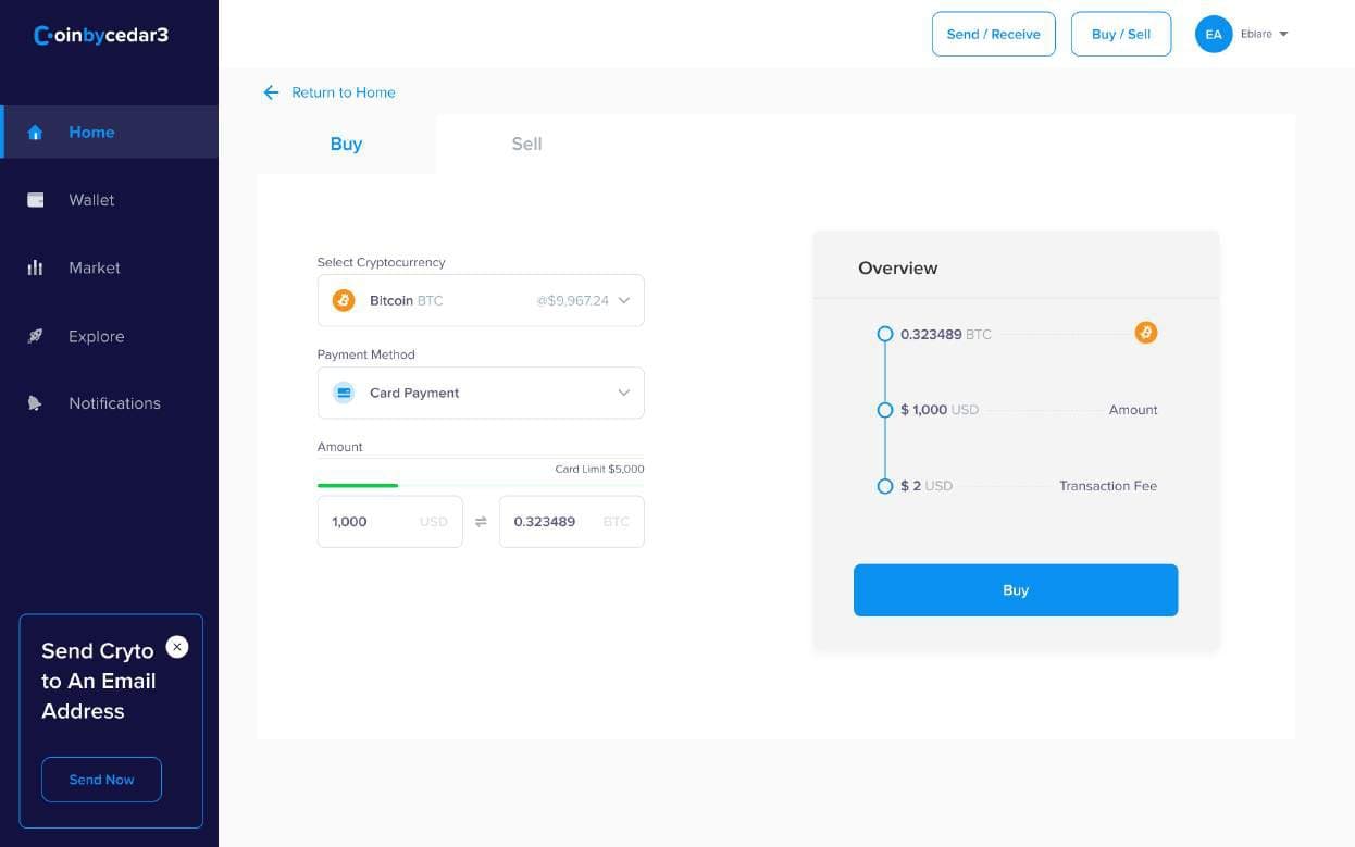
Coinbycedar3 is a crypto wallet for web and mobile: buy, sell, send and receive coins, follow prices, and keep up with crypto news, connected to a global payment gateway.
Most people don’t understand crypto trading, and most platforms are too complicated to navigate. Our job was to make the first trade feel safe and obvious.
Role & team
That’s me
Senior UI/UX Designer
Research, competitive analysis, interaction design, mobile and web UI; led two designers.
2 Product Designers
UI production across mobile and web.
PM, 2 engineers, business analyst
Requirements and build.
Research & insights
Because of COVID-19, we interviewed crypto adopters over Zoom and Google Meet, ran surveys, and did a heuristic evaluation and competitive analysis.
Platforms over-relied on technical terms and assumed users already understood finance and crypto.
Praised for its variety of coins and a simplified, beginner-friendly app.
Praised for usability and a clean, simple interface.
Education inside the product mattered as much as the trading tools.
Process
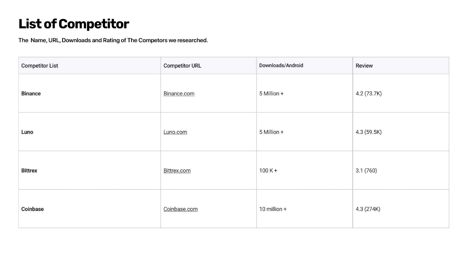
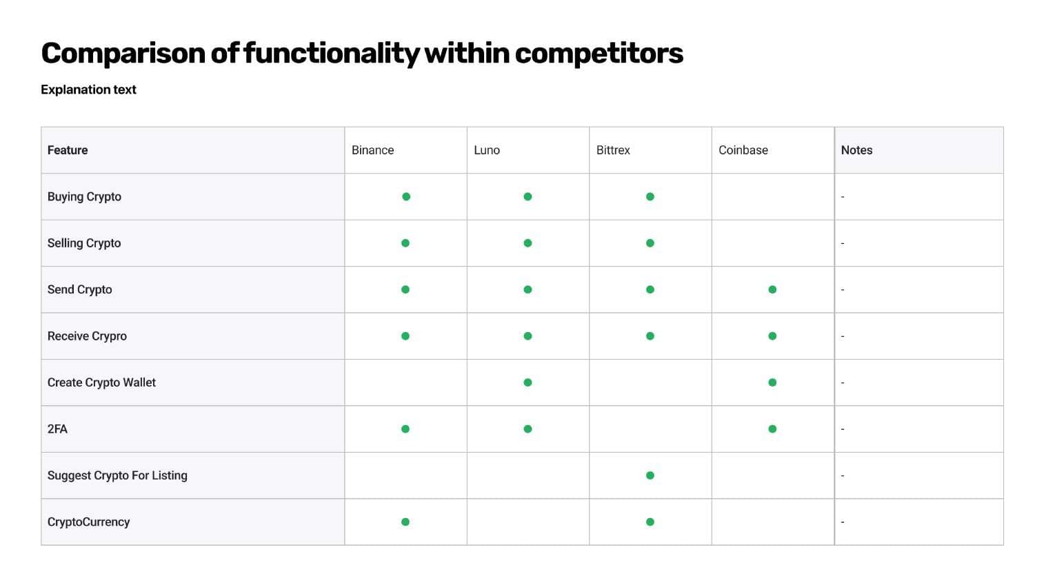
Listed competitors, compared features side by side, and studied what made Binance and Luno work.
Brainstormed and sketched ways to simplify buying and selling.
High-fidelity mobile and web flows with consistent patterns across both.
Key decisions
Decision 01
Portfolios across many coins are hard to read.
Decision 02
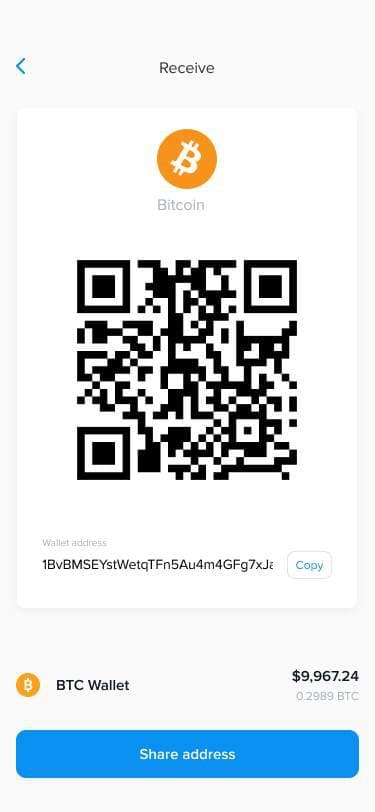
Long wallet addresses are error-prone to share.
Decision 03
Many users had to find external buyers or sellers.
Decision 04
As a financial product, fraud prevention was non-negotiable.
Mobile
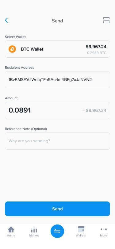
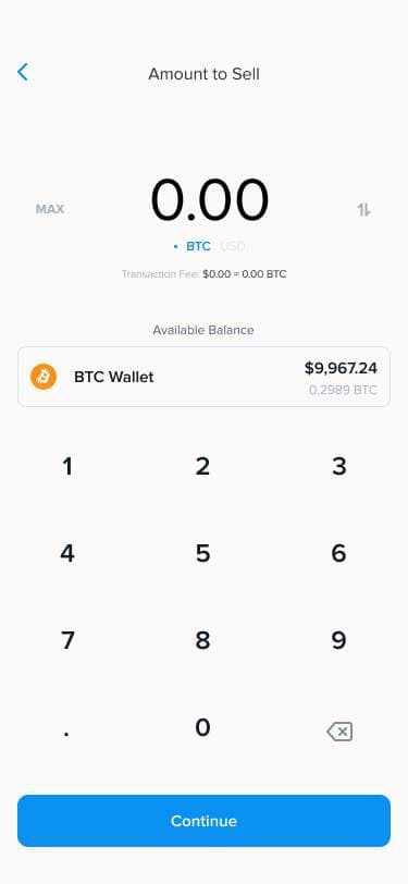
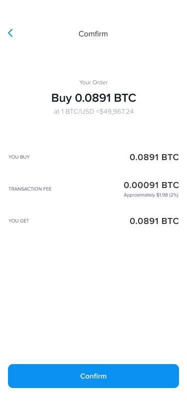
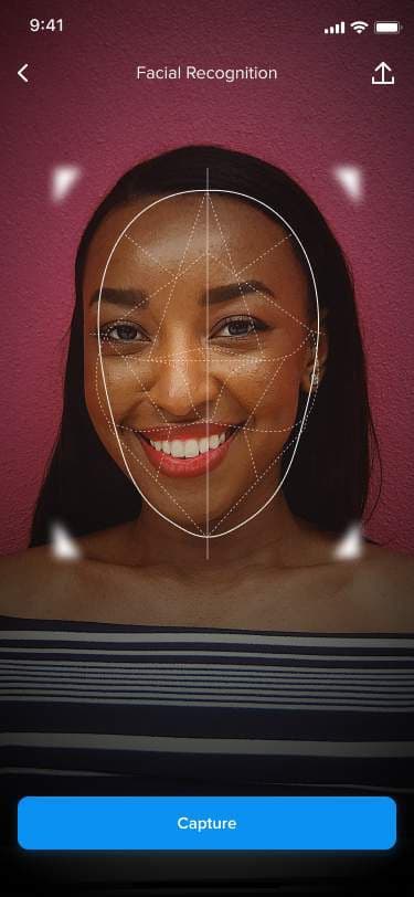
Web
Outcomes