Skip to content
All work

Character GuessLive beta

Family game night, turned into a live multiplayer game for 100+ players.

  • Designed end to end
  • Built with AI (Claude Code)
  • Shipped to production
  • Team of 3
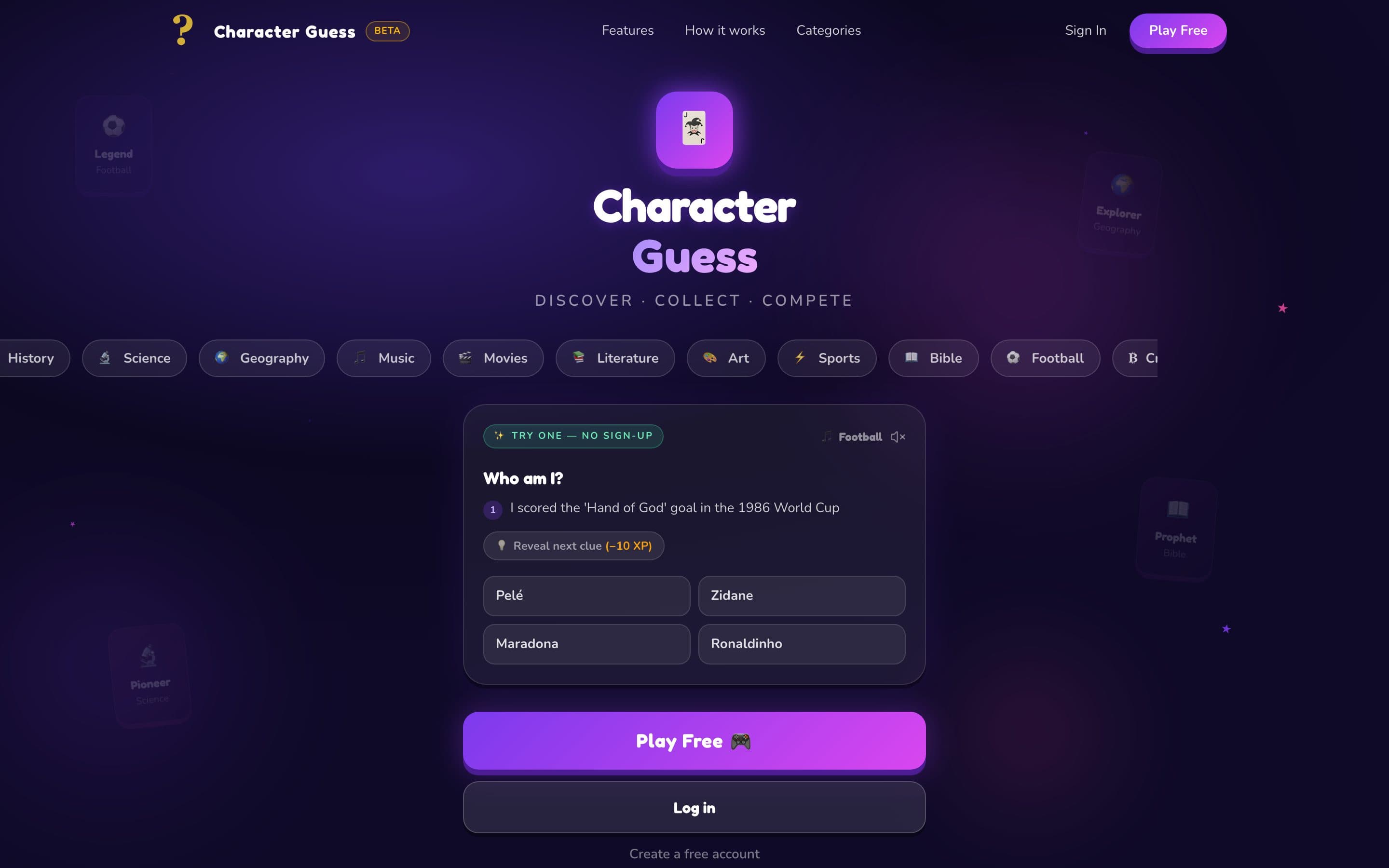
Character Guess landing page on desktop with a playable Who am I? demo card
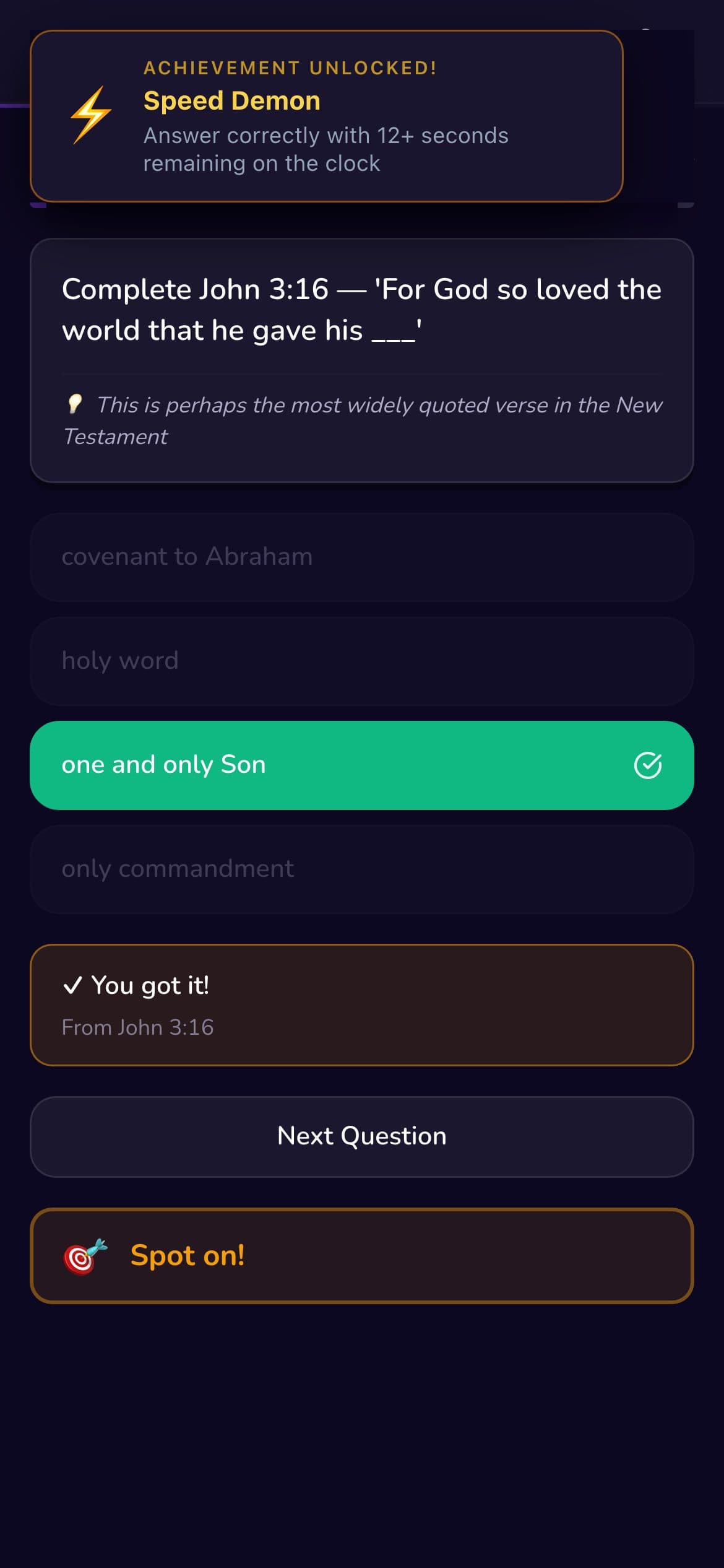
Character Guess on a phone: a correct answer highlighted in green with a Speed Demon achievement toast
The problem
Our family’s favourite game night, guessing characters from quotes, only worked when we were in the same room with someone willing to write the clues.
What I did
I designed the product end to end, then built the front end with Claude Code alongside a backend engineer and a PM, from prototype to a live web app.
The result
A live, installable game with 6 categories, 3 languages and 100+ beta players, grown entirely by word of mouth.
beta players, all word of mouth
100+
questions across 6 live categories
3,000+
languages: English, Spanish, French
3
one responsive design system
320px–4K
Role
Co-founder · product design & front-end (with AI)
Team
3 people: design, engineering, product
Timeline
Aug 2025 – present
Platform
Installable web app (PWA): mobile, tablet, desktop

Origin

It started at our dining table, and that’s still the test every feature has to pass.

On family game nights, my wife would write out quotes and clues about characters and we’d take turns guessing who said them. It never failed. Kids, adults, competitive cousins: everyone leaned in, because a good clue makes you feel clever the moment it clicks.

The problem was that it only worked in that room, and only when someone did the work of writing clues. I wanted to bottle that feeling into something anyone could open on a phone, play in two minutes, and share with the people they love.

Problem & context

The challenge: make a learning game feel like a party game, for ages 10 to 70, on any device.

Most knowledge games fall into one of two traps. They’re either educational and dull, or fun but shallow. We wanted the curiosity loop of a good clue, the competition of a leaderboard, and content people actually care about, starting with the Bible and football.

Our audience is unusually wide: families, church youth groups, football fans, classrooms. Most play on phones over mobile data, so it had to be fast, light and work without an app store.

Constraints

  • Small team of 3 with no dedicated QA or marketing budget
  • Young players, so parental consent and safety from day one
  • Must work offline-tolerant on low-end phones and look great on desktop
  • Content must scale to new categories without a redesign

Role & team

Three people, clear ownership. I owned the experience end to end and built the front end with AI.

  • That’s me

    Chukwuemeka Iheonye

    Co-founder · Product Designer & AI-assisted developer

    Product and UX direction, design system, every screen and flow, front-end build with Claude Code, accessibility.

  • Patrick Aziken

    Backend, DevOps & QA

    APIs and database, deployment pipeline (dev → beta → production), monitoring, end-to-end testing.

  • Gideon Idam

    Product Manager & Marketing

    Roadmap and priorities, beta programme, community growth and player feedback.

Research & insights

What game night and the early beta taught us became the rules we design by.

  1. 01

    The first round has to happen before any sign-up

    People wanted to play the moment someone shared a link. Asking for an account first broke the spell, so guests can play straight away.

  2. 02

    Clues beat questions

    Revealing clues one at a time created the ‘oh, I know this!’ moment from game night. Faster guesses earn more points, which rewards knowledge without punishing slower readers.

  3. 03

    Not everyone can be number one

    A single global leaderboard only motivates the top few. Smaller weekly leagues give everyone a race they can actually win.

  4. 04

    Mastery is per topic

    A Bible expert is often a football beginner. Treating progress as one score made new categories feel pointless for experts.

Key decisions

The decisions behind the screens. Each one traded something, on purpose.

  1. Decision 01

    Let guests play first, with a 3-game limit

    First-time players often arrive from a link shared in a family or church group chat. A sign-up wall at that moment kills the fun.

    Options considered

    • Require an account up front
    • Unlimited guest play
    • Limited guest play, then a reason to sign up
    What we chose
    Guests get 3 full games. Progress is saved locally, with a gentle prompt to create an account and keep it.
    Why
    It lowers the barrier to zero while giving a clear, honest reason to sign up: don’t lose what you’ve earned.
    The trade-off
    More complexity: guest progress has to migrate cleanly into a new account, and guest abuse needs server-side limits.
  2. Decision 02

    Stay a quiz, not a drawing game

    As the backlog grew, we were tempted by drawing and party features (canvas sketching, chain drawing, projection mode).

    Options considered

    • Pivot to Pictionary-style drawing
    • Keep clue-based multiple choice
    What we chose
    Keep the clue-and-answer core and remove all drawing proposals from the roadmap.
    Why
    Clues work for every age, on every phone, in seconds, and the content scales to any category. Drawing would have doubled the product.
    The trade-off
    We gave up some party chaos in exchange for a sharper, more accessible core loop.
  3. Decision 03

    Freeze V1 features to fix the foundations

    After 11 sprints, tester feedback was clear: new features were arriving faster than old ones felt solid.

    What we chose
    Stop new features in V1. Only bug fixes, tester feedback and polish. Everything else moved to the V2 backlog.
    Why
    Trust is the product. A game that loses your streak once won’t get a second chance.
    The trade-off
    Some exciting features waited months, which was a hard conversation with our most engaged players.
  4. Decision 04

    Design tokens instead of hard-coded colours

    The first redesign used hard-coded white overlays, which made a proper light mode impossible.

    What we chose
    A semantic token system (glass surface, border, divider, high, mid and low emphasis text) that resolves per theme.
    Why
    Components stopped caring which theme they were in. Light mode went from a rewrite to a token change.
    The trade-off
    A one-off migration across every screen, but every component since has been faster to build.
  5. Decision 05

    Separate progress for each category

    With one shared XP score, a Bible Legend would start football as a Legend too, which makes a new category meaningless.

    What we chose
    Separate XP per category, with rank names that match the theme (Seeker → Legend for Bible, Rookie → Legend for football).
    Why
    Every new category becomes a fresh journey, which is exactly what drives people to explore.
  6. Decision 06

    Generate sound in code, not audio files

    The audio library added 180 KB and a dozen file downloads, painful on the low-end phones many of our players use.

    What we chose
    All 12 sound effects are synthesised in the browser with the Web Audio API.
    Why
    Zero network requests, instant playback, and a lighter app. Audio never auto-plays, and players control sound in settings.
    The trade-off
    Synth sounds are simpler than produced audio, so we tuned them to feel playful rather than realistic.

How V1 evolved

V1 didn’t arrive finished. Here’s what changed along the way, and why.

  1. Aug 2025

    Prototype in days

    Generated a first playable version with an AI app builder to test the core loop at game night before investing in design.

  2. Mar 2026

    Open the door

    Guest play with a 3-game limit, plus parental consent for young players.

  3. Apr 2026

    Make it fair

    Scores, coins and multiplayer moved to server-verified logic so nobody can cheat, while guests can still join rooms. Daily coin limits stopped farming.

  4. Apr 2026

    Freeze and stabilise

    V1 feature freeze at Sprint 11; kept the quiz format; backlog moved to V2.

  5. May 2026

    Reliable releases

    Separate dev, beta and production environments, error monitoring, and a clearer password reset flow.

  6. Jun 2026

    The redesign

    Glass-card design language, light and dark themes, football category, weekly leagues, notifications, and an app that updates itself.

  7. Jul 2026

    Own the platform

    Moved off a hosted backend to our own API and database, so the platform could grow into V2 without vendor limits.

Mobile

Designed thumb-first: everything that matters sits in the bottom half of the screen.

Most players are on phones, often one-handed on a sofa or in a group. Navigation lives in a bottom bar, answers are full-width targets, and feedback is instant and readable at arm’s length.

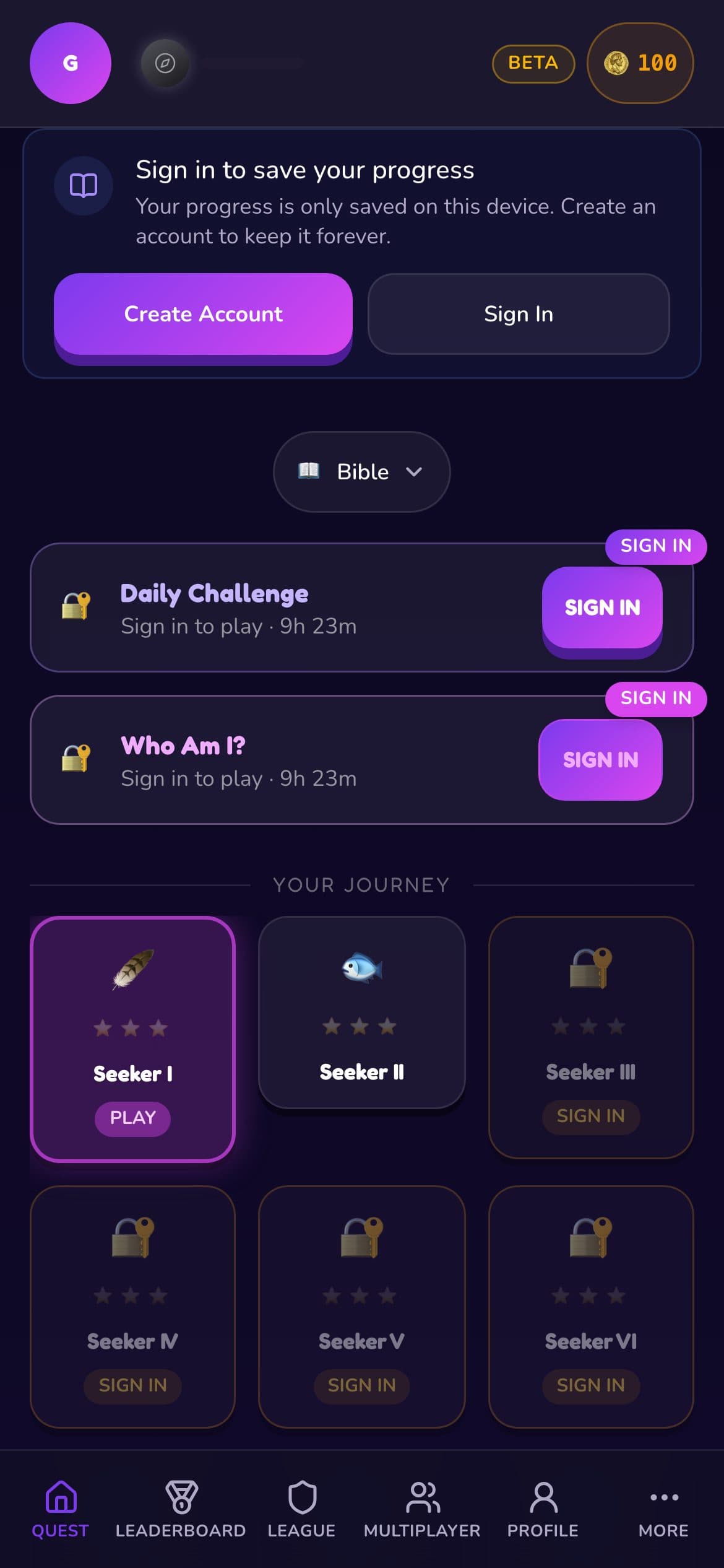
Level map showing the player's journey from Seeker I to Learner levels
Your journey: progress is a path, not a list.
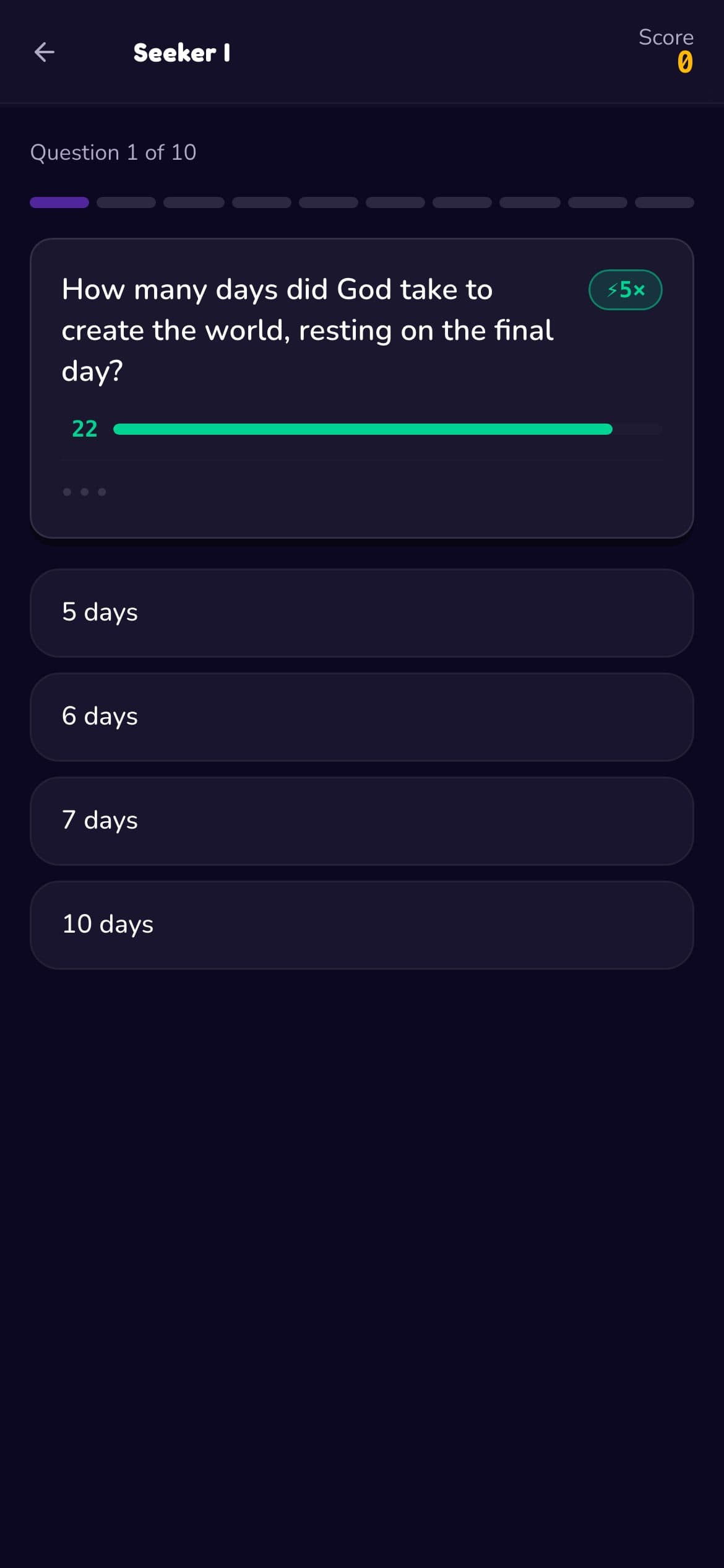
A question with a countdown bar, speed multiplier and four answer options
Clue, timer and four big answer targets.
Correct answer in light mode with a scripture reference and achievement toast
Instant feedback, with the source.
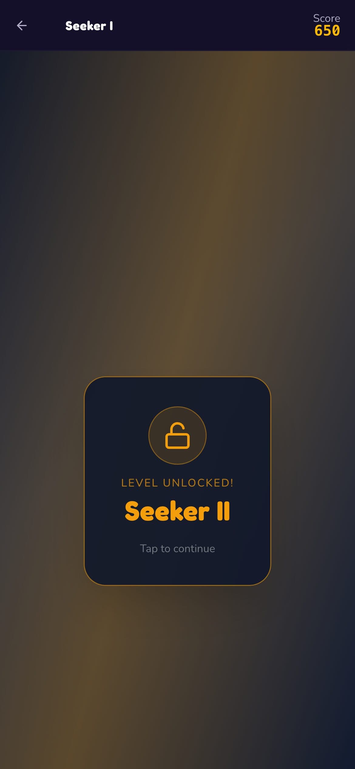
Level unlocked card for Seeker II
Small wins, celebrated.
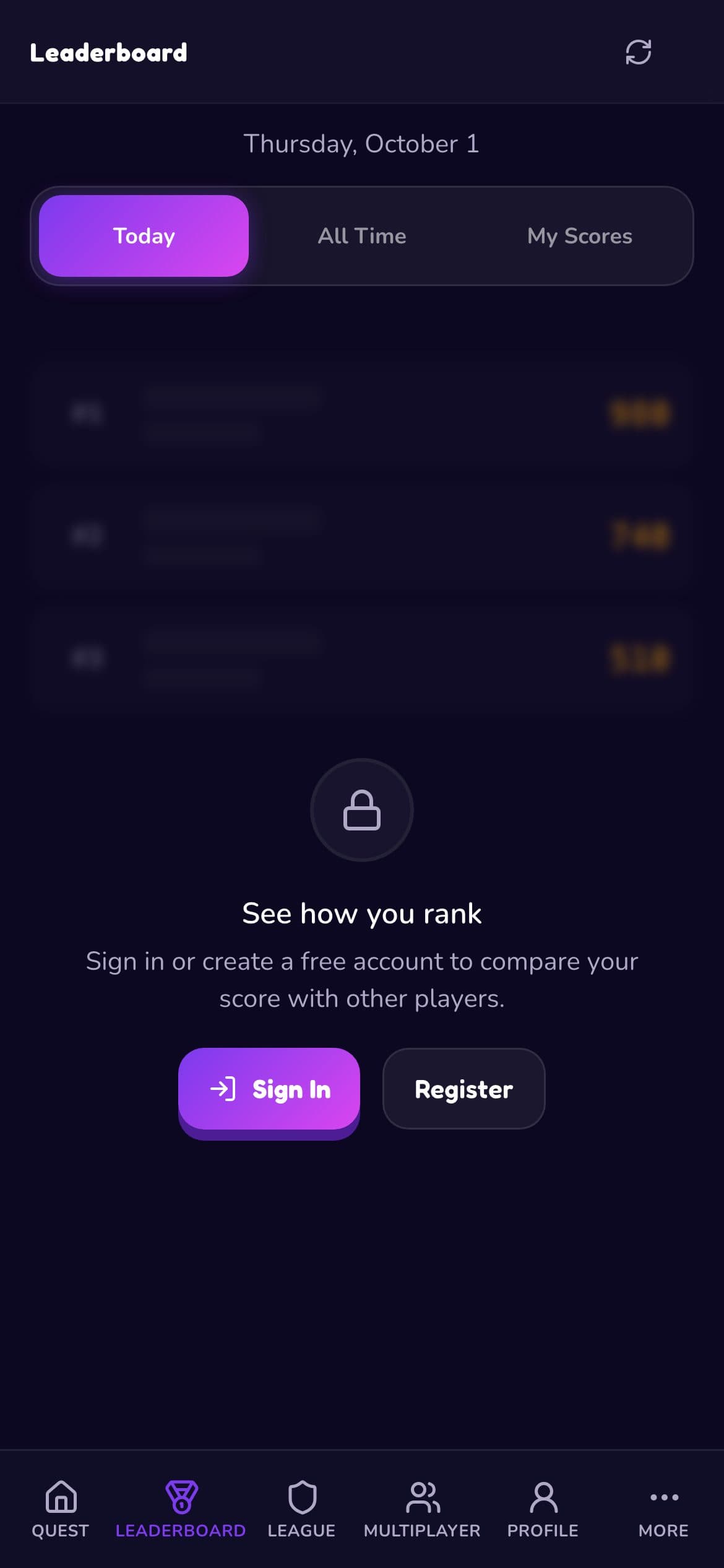
Leaderboard blurred for guests with a prompt to sign in
Guests see what they’d unlock.
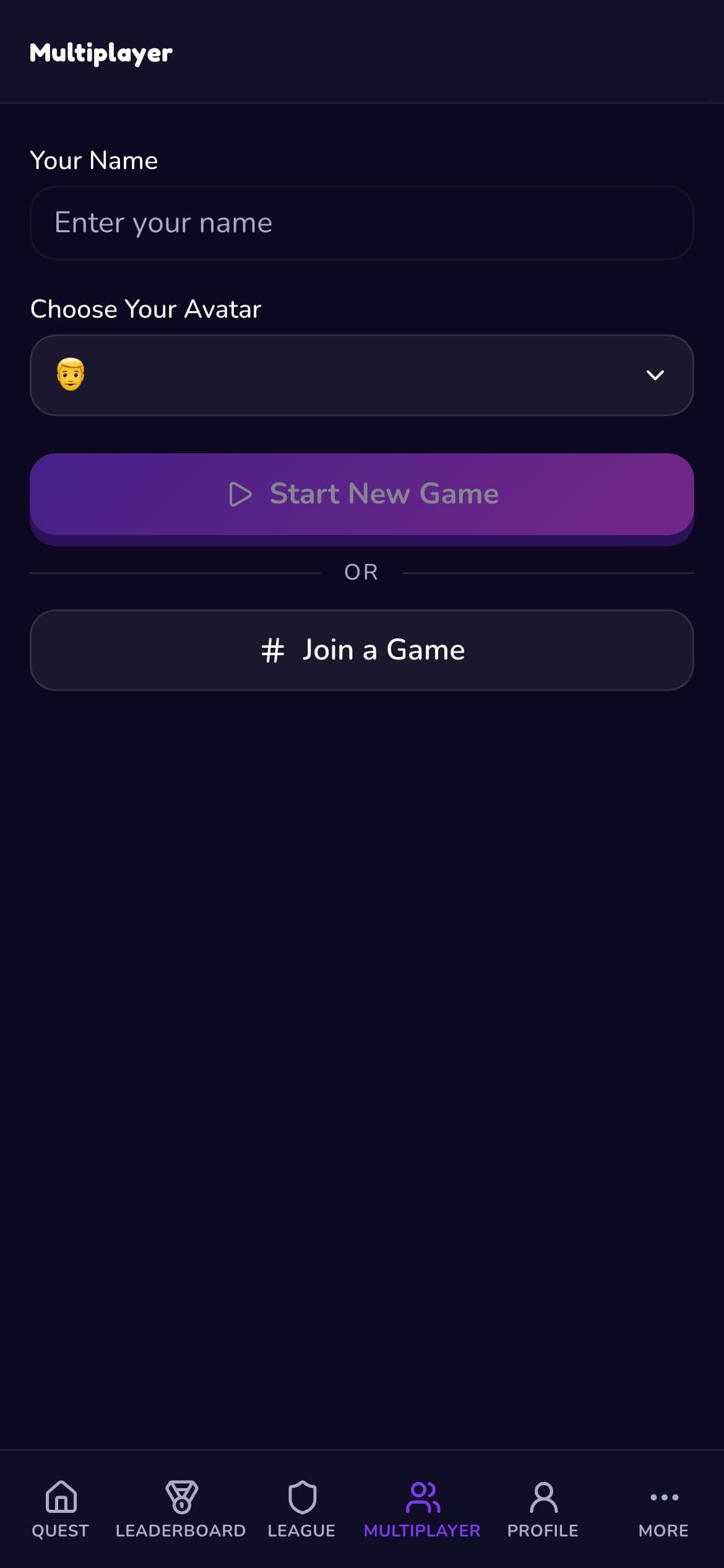
Multiplayer lobby to start a new game or join with a code
Multiplayer in two taps.
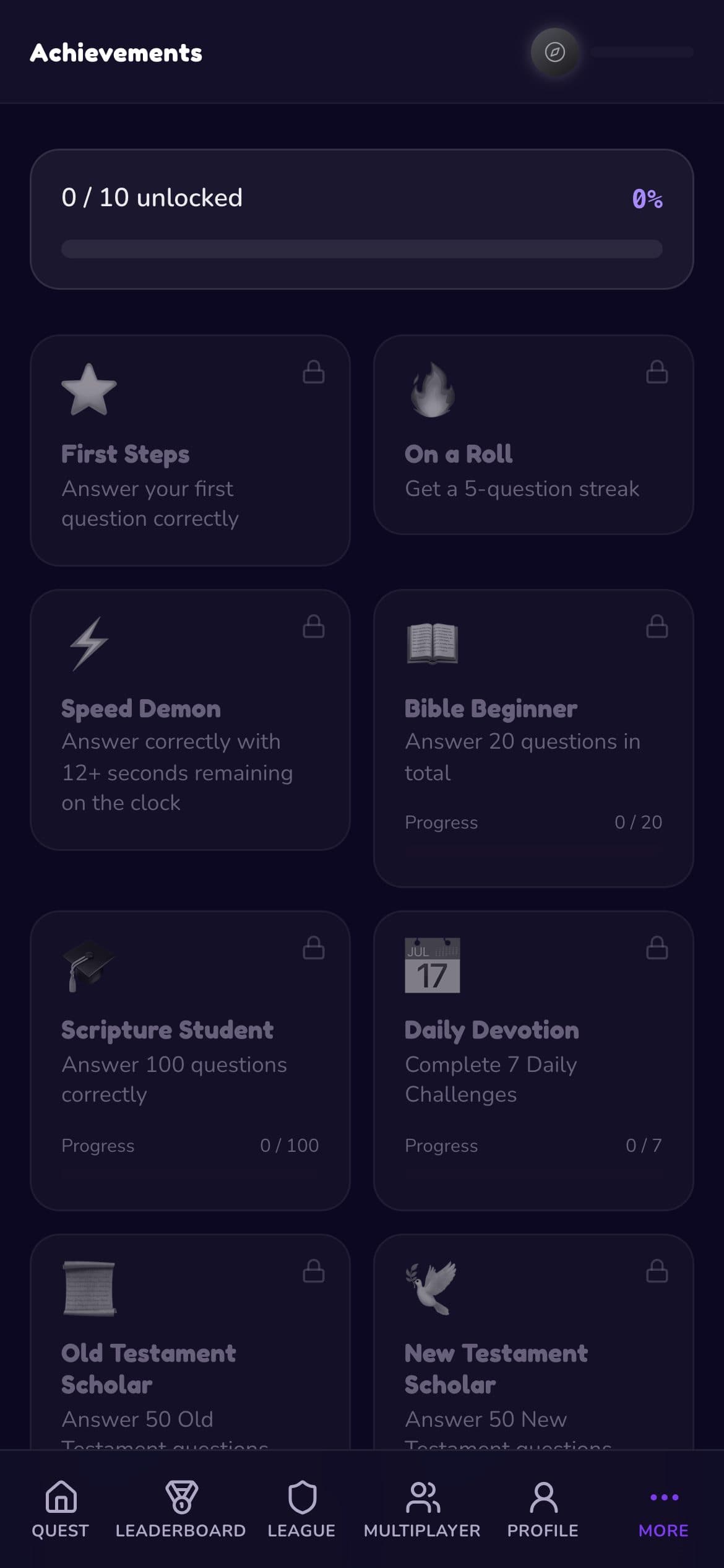
Achievements grid with locked and in-progress badges
Goals for every play style.

Web

On larger screens, navigation moves to a sidebar and the game stays focused in the centre.

Below 1024px, a bottom bar keeps navigation in reach of thumbs. Above it, a fixed sidebar takes over. The question card never stretches across a wide screen; it stays in a readable column so your eyes don’t travel.

Desktop landing page with category chips and a playable demo
Landing: play a real question before signing up.
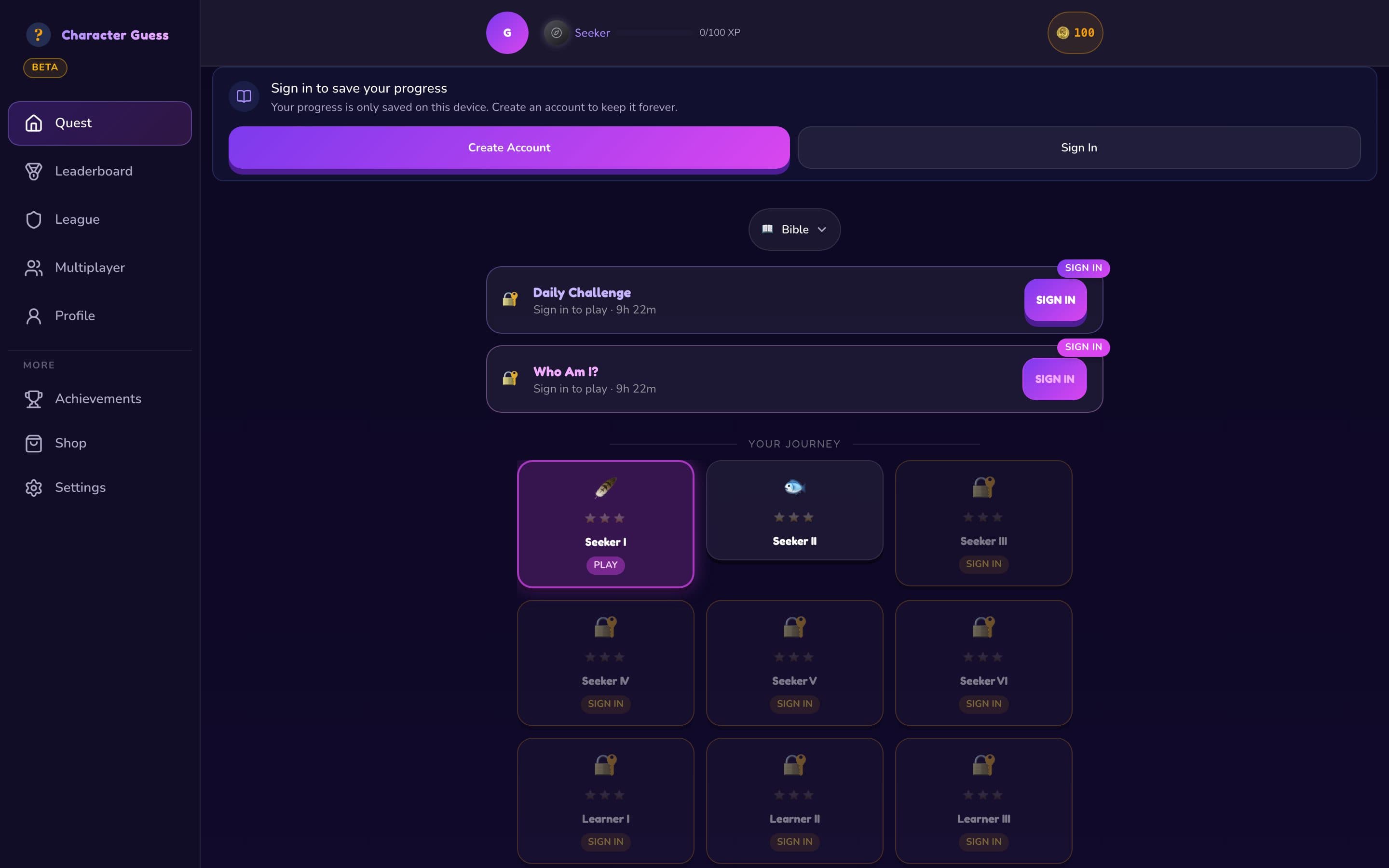
Desktop level map with sidebar navigation in dark mode
Sidebar navigation from 1024px up.
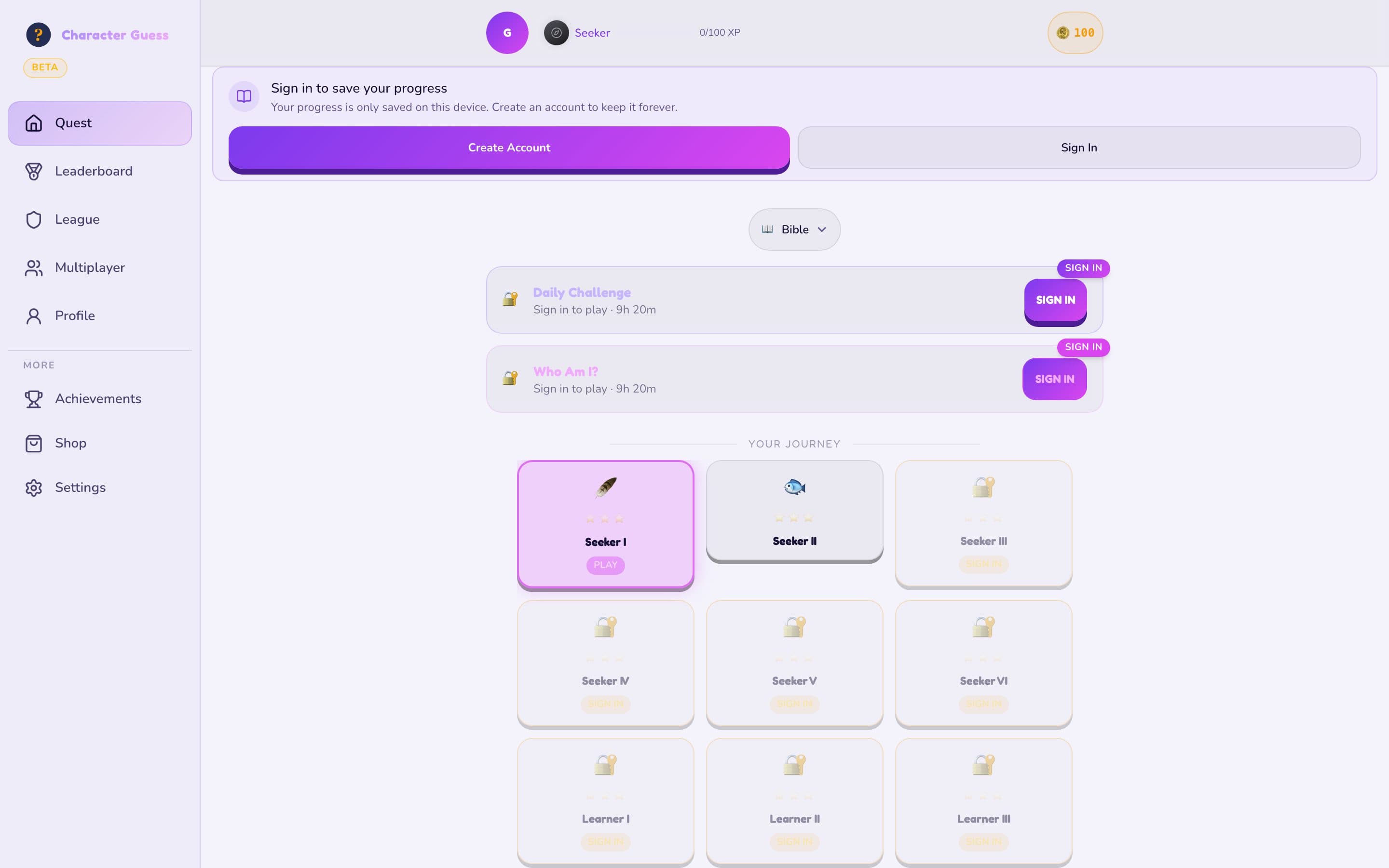
Desktop level map in light mode
The same screen in light mode, driven by tokens.
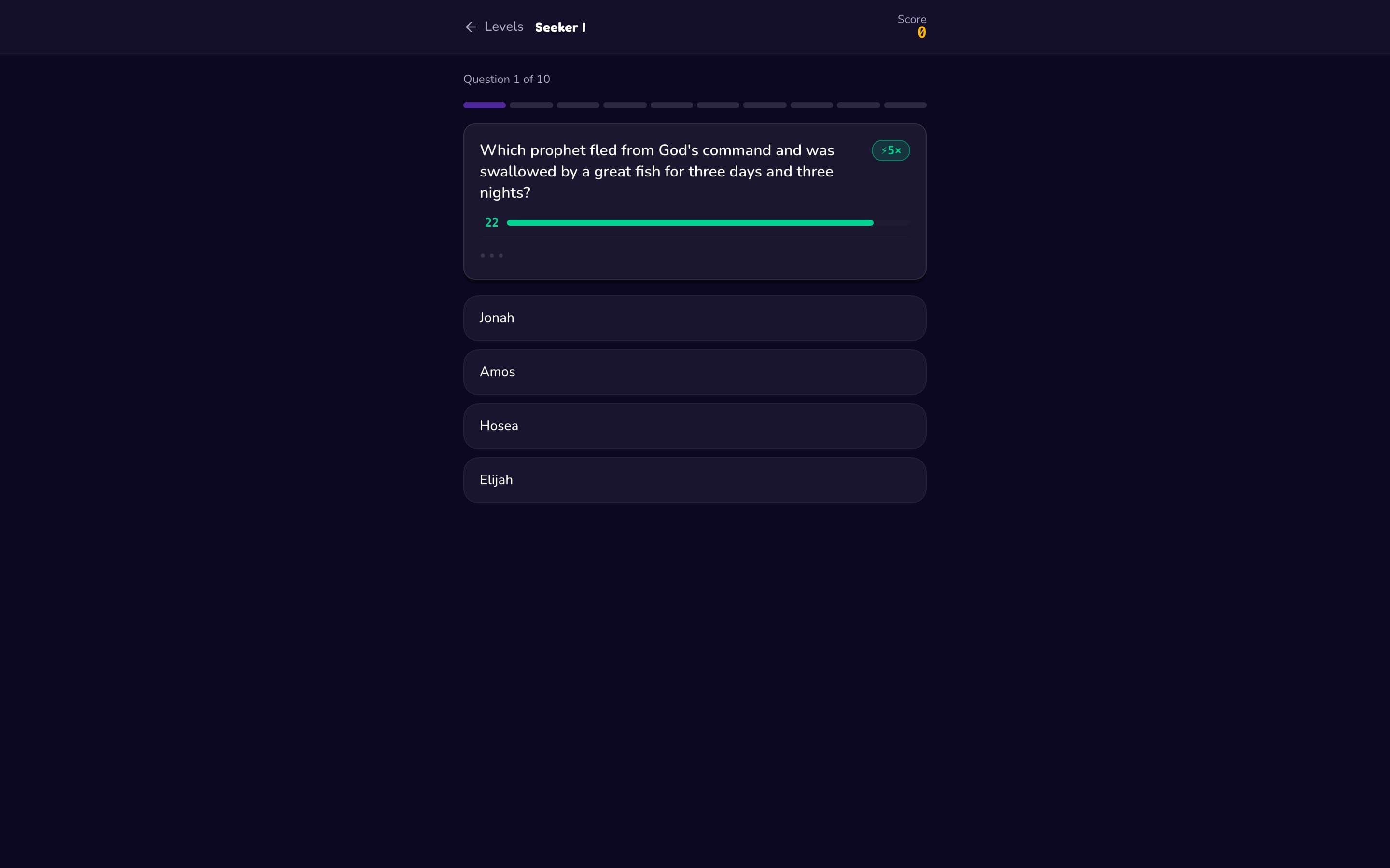
Desktop game screen with the question in a centred column
Focus mode: one readable column.

Design system

One token system powers both themes, 8 breakpoints and every screen.

Colour

  • Violet

    #7C3AED

    Primary actions, progress

  • Magenta

    #D946EF

    Gradient partner for highlights

  • Gold

    #F59E0B

    Rewards, coins, achievements

  • Night

    #0C0821

    Dark theme background

  • Lavender

    #F5F2FF

    Light theme background

  • Success

    #10B981

    Correct answers

  • Error

    #EF4444

    Wrong answers, destructive actions

Type

Plus Jakarta Sans

One variable family (200–800) for everything. Friendly at large sizes, legible at small ones, and only one font to load.

Semantic tokens
TokenLightDark
--glass-bgrgba(0,0,0,.04)rgba(255,255,255,.06)
--glass-borderrgba(0,0,0,.09)rgba(255,255,255,.10)
--text-hiink 92%white 92%
--text-midink 55%white 55%

Components and their states

  • Answer option

    • Default
    • Pressed
    • Correct
    • Wrong
    • Disabled
  • Level tile

    • Current
    • Unlocked
    • Completed (1–3 stars)
    • Locked
  • Clue card

    • Hidden
    • Revealing
    • Revealed
    • Hint used
  • Timer bar

    • Calm
    • Urgent
    • Expired
  • Navigation

    • Bottom bar (mobile)
    • Sidebar (desktop)
    • More drawer
  • Rewards

    • Coin ring
    • Achievement toast
    • Level unlocked
    • League badge

Motion15+ named animations share one elastic easing curve: question enter, answer pop, wrong-answer shake, character reveal, timer urgency. All of them are switched off for people who ask their device for less motion.

Accessibility

Built to WCAG 2.2 AA, then audited honestly for this case study.

What we built in

  • Targets you can actually hit

    Every control is at least 44×44px; primary actions are 48px, with 8px between targets.

  • Keyboard and focus

    Visible focus rings, a skip link, logical tab order, and dialogs that trap focus and close with Escape.

  • Screen readers

    Landmarks, a strict heading order, labelled buttons, and live announcements for scores, coins and toasts.

  • Motion and sound

    Animations respect reduced-motion settings (confetti becomes a static badge), and audio never auto-plays.

  • Forms that explain themselves

    Errors are announced to screen readers and linked to the field they belong to.

What my audit found, and the fix

  • Low-emphasis text is too faint

    Our lowest text token measures 3.5:1 in dark mode and 2.4:1 in light mode, below the 4.5:1 minimum. The fix is to raise it and reserve it for non-essential text.

  • Light-mode secondary text

    Mid-emphasis text in light mode is 4.0:1. Darkening it slightly brings it to AA with no visual cost.

  • Game screen landmark

    The in-game screen is missing a main landmark, so the skip link has nowhere to land. A one-line fix, now on the list.

How I built it

AI writes the code fast. My job is deciding what’s right, and proving it.

Character Guess started as an AI-generated prototype in Lovable, then moved to Claude Code once we knew the game was worth building properly. I design in the browser, brief Claude in plain language, and treat everything it writes as a pull request from a fast, confident junior: useful, and wrong often enough that nothing ships unverified.

commits in the repo
1,006
of them mine
735
co-authored with Claude
512
unit test files, plus Playwright E2E
40
  1. 1

    Prototype to learn

    An AI-generated prototype let us test the core loop at real game nights within days, before designing anything polished.

  2. 2

    Brief like a designer

    Each prompt carries the user problem, the screen and state it lives in, the constraint that matters (mobile nav, dark mode, server-owned numbers) and how we’ll know it works. Bug briefs start from the player’s report, not my guess at the cause.

  3. 3

    Components from the system

    New UI is built from the design tokens and existing components, never one-off colours. A project skill tells Claude the traps before it writes a line: the bottom-nav z-index, sheet heights on short phones, and never computing coins or lives on the client.

  4. 4

    Reproduce, then fix

    Claude has to reproduce a bug before fixing it, find where it came from in git history, and explain the root cause in the commit. Most fix commits read like a short incident report.

  5. 5

    Verify in the browser

    Passing type checks isn’t done. Changes are checked live in the browser, on the real flows, before they’re called finished.

  6. 6

    Review and release

    Patrick reviews backend and infrastructure changes. CI blocks merges on type checks, lint, translation lint, unit tests and Playwright E2E, then releases move from dev to beta to production.

How the repo keeps AI honest

Shared memory

  • A memory bank of context, decisions, patterns and session logs that every AI session reads first
  • A rule that the memory bank is updated before any task counts as done
  • A decision log recording why, not just what, so AI doesn’t undo deliberate choices

Guardrails in code

  • Strict TypeScript on frontend and backend, checked in CI
  • Unit tests for game logic and content claims, Playwright for real user journeys
  • Translation linting so English, Spanish and French never drift apart

Safe releases

  • Separate dev, beta and production environments with their own databases
  • Idempotent, checksummed migrations that fail fast before a deploy
  • Sentry error tracking and a GitHub release only after production is verified

What AI got wrong, and how I caught it

  1. 01

    It advertised categories that don’t exist

    What went wrong
    AI-written landing copy and search metadata promised History, Geography and Science. None were playable, and Science didn’t exist at all.
    How I caught it
    I audited every number and category claim on the page against live API data, line by line.
    So it can’t happen again
    A test now fails CI if the copy names a category that isn’t live. It’s the snippet below.
  2. 02

    A ‘type safety’ fix broke host handover

    What went wrong
    Claude added a uuid cast to a database call whose parameter is text. Every attempt to take over hosting a multiplayer room failed.
    How I caught it
    Testing a new sign-in gate locally returned an unexpected 422. Git history showed the earlier version had been right, so the fix restored it.
  3. 03

    Lives showed a full refill that never happened

    What went wrong
    The new hearts system never updated its regeneration timestamp, so after one wrong answer players could see 5 lives when they had 1.
    How I caught it
    Reproduced it against a local Postgres database: dropping from 5 lives to 1 still displayed 5.
    So it can’t happen again
    Lives are now server-authoritative, and the project skill tells AI never to compute them on the client.
  4. 04

    Code that type-checked but crashed

    What went wrong
    A prop missing from a destructure crashed the landing page demo, and a share link scoped inside a callback crashed multiplayer rooms. Both passed the compiler.
    How I caught it
    Clicking through the real flows in the browser, which is why browser verification is a step, not a nice-to-have.
  5. 05

    Prototype leftovers in production

    What went wrong
    The original Lovable heart favicon was still shipping, and its dev plugin bundled an old Tailwind that broke the build after an upgrade.
    How I caught it
    A WhatsApp link preview showed someone else’s logo, and the dev server failed with PostCSS errors.
    So it can’t happen again
    Replaced the icons with real brand assets and removed the plugin.
  6. 06

    The AI’s memory went stale

    What went wrong
    The memory bank fell 33 days and 60+ commits behind the code, so new sessions were working from an outdated picture of the product.
    How I caught it
    Checking the docs against git history turned up 60+ commits the memory bank knew nothing about.
    So it can’t happen again
    Updating the memory bank is now part of the definition of done.

One guardrail, in code

src/lib/landingClaims.test.ts

// Names that must never be advertised as available: the roadmap categories,// plus "Science", which the app doesn't have at all.const NOT_PLAYABLE = [...categories.comingSoon.map((c) => c.label), 'Science']; describe('search-result metadata', () => {  const description = indexHtml.match(/name="description"\s+content="([^"]*)"/)?.[1] ?? '';  const structured = [...indexHtml.matchAll(/"description":\s*"([^"]*)"/g)].map((m) => m[1]);   it.each(NOT_PLAYABLE)('does not advertise %s, which is not playable', (name) => {    const re = new RegExp(`\\b${name}\\b`, 'i');    expect(description).not.toMatch(re);    for (const text of structured) expect(text).not.toMatch(re);  });});
Written after catching AI-generated marketing copy promising categories we hadn’t built. If anyone, human or AI, puts an unreleased category in the search description again, CI fails before it ships.

Outcomes

A real product, used by real people, built by a team of three.

  • Live at characterguess.com with 100+ beta players, grown entirely by word of mouth
  • 6 live categories, 450 characters, 3,000+ questions and 3 languages
  • Installable on any phone with offline support and self-updating releases
  • Reliable release pipeline with separate dev, beta and production environments
  • Consistently positive feedback from families, church groups and football fans

Reflection & next

What I’d tell myself on day one, and what comes next.

  1. 01Ship less, sooner. The feature freeze improved the product more than any feature we added.
  2. 02Start with tokens. The light-mode retrofit would have been free if semantic tokens existed from the first screen.
  3. 03AI makes building fast; decisions make it good. The written decision log mattered as much as the code.
  4. 04Audit your own work. Writing this case study surfaced contrast gaps we’d missed, now first on the fix list.

Coming next

V2 is coming

We’re rebuilding Character Guess as a platform: a new player app, an admin dashboard for content, a marketing site and a dedicated API, ready for real-time multiplayer at scale, classroom mode and many more categories.