Skip to content
All work

Carbon Loans

Grew loan applications 20% and cut bad loans 10% at a bank serving 3M+ people.

  • Lead Product Designer
  • Led a team of 2 designers
  • Research to handoff
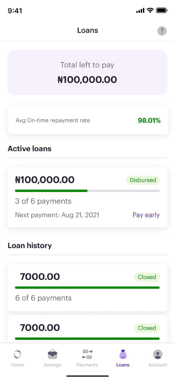
Redesigned Carbon loans dashboard showing total left to pay, active loans and loan history
The problem
Loans are the heart of Carbon’s business, but customers were confused by wordy screens, unclear offers and declines with no explanation, so many never took up the loans they qualified for.
What I did
I led the redesign end to end: stakeholder interviews, research with 15 customers and 2,700+ survey responses, then a new loan dashboard, application, offer, bank statement and repayment flows.
The result
Every target met or beaten: loan applications up 20% against a 15% goal, drop-offs down 10%, and non-performing loans down 10%, so more people borrowed and more of them repaid.
loan applications (target: +15%)
+20%
loan drop-offs (target met)
−10%
non-performing loans
−10%
customers on the platform
3M+
Company
Carbon MFB
Role
Lead Product Designer
Team
3 designers, 1 PM, 6 engineers, 1 QA, 1 scrum master
Platform
iOS and Android
Tools
Figma, FigJam, Confluence, Jira

Problem & context

Credit runs the economy, and Carbon’s loan product was getting in its customers’ way.

Carbon is a credit-led digital bank offering instant loans, Buy Now Pay Later and savings. Loans are the heart of the business, so small points of confusion turn directly into lost revenue and lost trust.

The goal was to redesign the experience to reward loyal customers, make the journey easier to understand, and improve the business’s margins by reducing loans that were offered but never taken up.

Constraints

  • A live product with millions of customers, so no big-bang changes
  • Lending rules and credit decisions owned by a separate team
  • Under NDA: sensitive data in the screens below is blurred

Role & team

I led design within a cross-functional team of twelve.

  • That’s me

    Chukwuemeka Iheonye

    Lead Product Designer

    Research, problem framing, interaction design, UI and prototypes; led two designers and partnered with product and engineering.

  • Design

    2 Product Designers

    UI production and design QA across the flows.

  • Product & engineering

    PM, 6 engineers, QA, scrum master

    Scope, build, testing and delivery.

Research & insights

Customers weren’t avoiding loans. They were avoiding confusion.

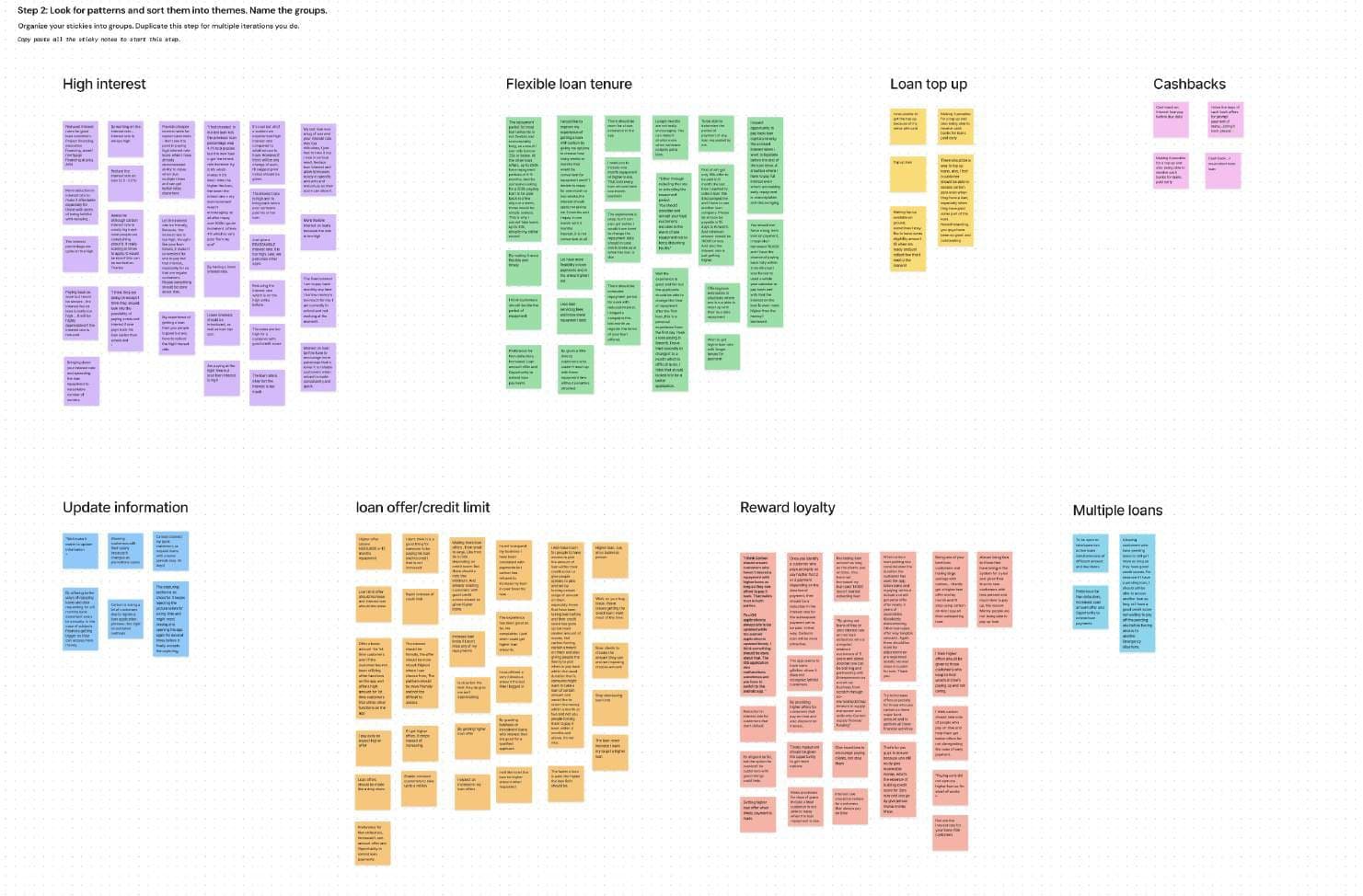
We interviewed 15 customers about why they weren’t taking up loans, and a survey drew 2,700+ responses. Affinity mapping turned what we heard into clear themes.

  1. 01

    Offers didn’t fit the amount

    Tenors weren’t matched to the loan. A ₦2,000 loan shouldn’t come with a 3-month tenor.

  2. 02

    Declines felt like a dead end

    Customers were declined with no reason, so they didn’t know what to change or whether to try again.

  3. 03

    Good borrowers wanted recognition

    Reliable customers expected better offers, top-ups on unused limits and rewards like cashback for paying early.

  4. 04

    The words got in the way

    A wordy welcome screen and ‘Skip and continue’ buttons on steps that weren’t optional made the flow feel untrustworthy.

Process

From interviews to sticky notes to a prioritised set of fixes.

  1. 01

    Audit the current journey

    Mapped seven concrete problems in the live app, from wordy screens to the app resetting to the homepage when the phone locked.

  2. 02

    Listen at scale

    15 in-depth interviews plus a 2,700+ response survey, combining the why with the how many.

  3. 03

    Synthesise and act

    Affinity mapping grouped findings into themes, then into action points the team could own.

Affinity map of research findings grouped by theme in FigJam
Affinity mapping the research into themes.

Key decisions

Six changes, each tied to something customers told us.

  1. Decision 01

    Give loans a home: a dedicated dashboard

    There was no clear path to apply for a loan or see your loan history.

    What we chose
    A loan dashboard showing what’s left to pay, active loans, history, on-time repayment score and credit bureau record.
    Why
    Shorter time to start an application, and customers can see their credit standing before they decide.
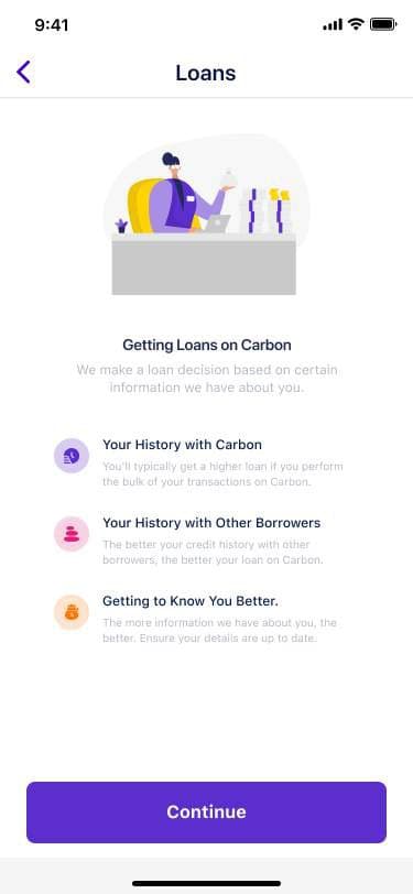
  2. Decision 02

    Explain every offer, and every decline

    Customers struggled to understand their offer and were declined without a reason.

    What we chose
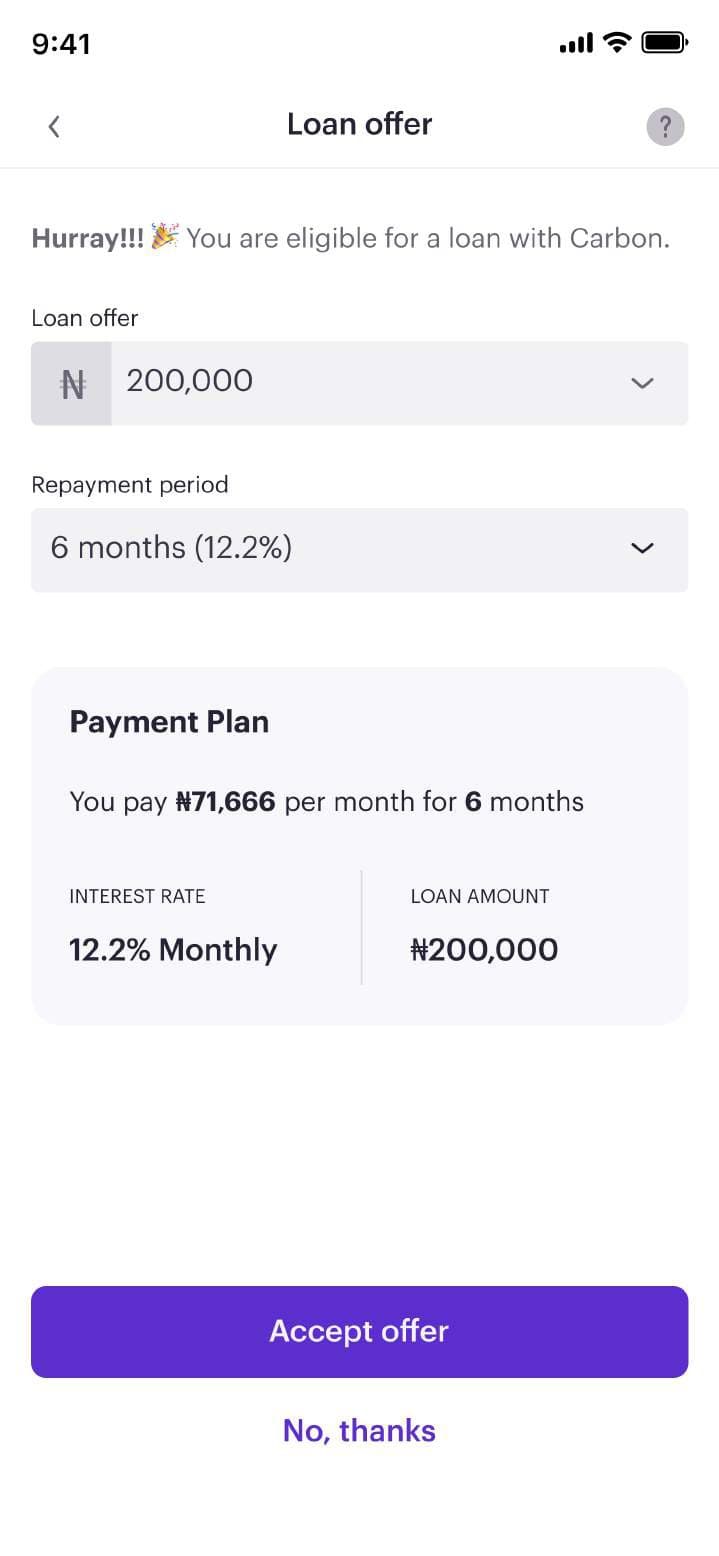
    A simplified offer screen with a clear payment plan, alternative offers, and explicit decline reasons.
    Why
    Understanding increases acceptance. Decline reasons also give the credit team data to improve offer criteria.
    The trade-off
    Showing reasons meant working closely with the decisioning team on what could be shared safely.
  3. Decision 03

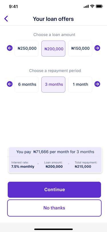
    Match tenors to the loan

    Every amount came with the same tenor options, however small the loan.

    What we chose
    Tenors that adapt to the offer amount.
    Why
    Fewer impossible choices and more sensible repayment plans.
  4. Decision 04

    Say what the step actually does

    Steps that were required still said ‘Skip and continue’, even after customers had completed them.

    What we chose
    Rewrote the UX copy so buttons and progress reflect the real state of each step.
    Why
    Honest language builds trust in a product that handles people’s money.
  5. Decision 05

    Accept statements from more banks

    Offers were limited by the information Carbon could see.

    What we chose
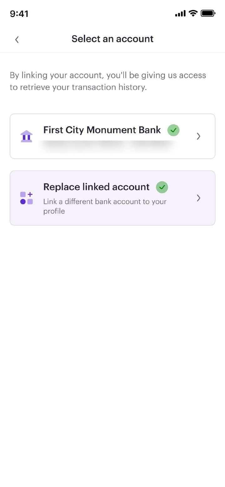
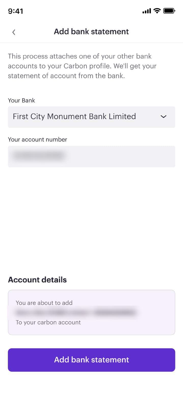
    A new bank statement flow that links other bank accounts.
    Why
    More information means better offers for customers and better risk decisions for the business.
  6. Decision 06

    Make repayment the easiest screen in the app

    Repayment is the most important moment for the business in the loan flow.

    What we chose
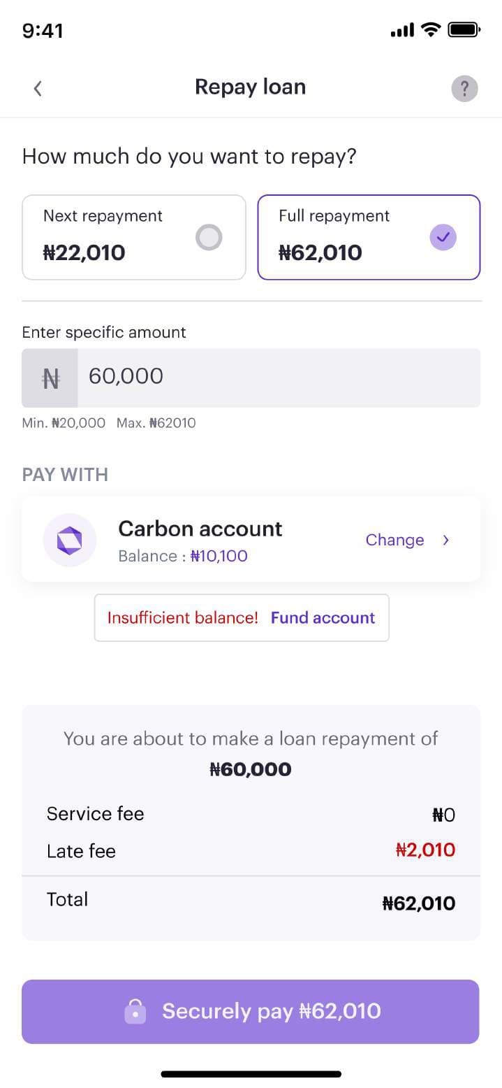
    A clear repayment screen with full or partial amounts, wallet funding in place, and a ‘pay as you get’ option.
    Why
    If repaying is effortless, more loans are repaid on time, and customers qualify for more.

Before

Where we started: wordy, ambiguous and easy to abandon.

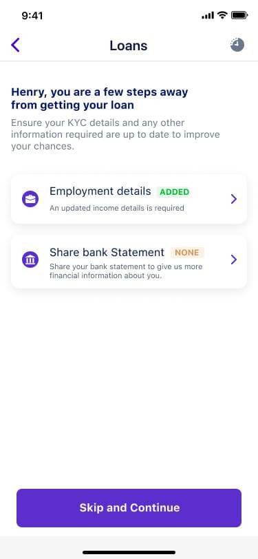
  • Old loan welcome screen with long explanatory text
    A welcome screen too wordy to use.
  • Old loan steps screen with a Skip and Continue button
    ‘Skip and continue’ on a required step.
  • Old loan offers screen with fixed tenor options
    Offers that were hard to compare.

Mobile

The redesigned journey, from first look to final repayment.

Loans dashboard with active loans and history
Everything about your loans, at a glance.
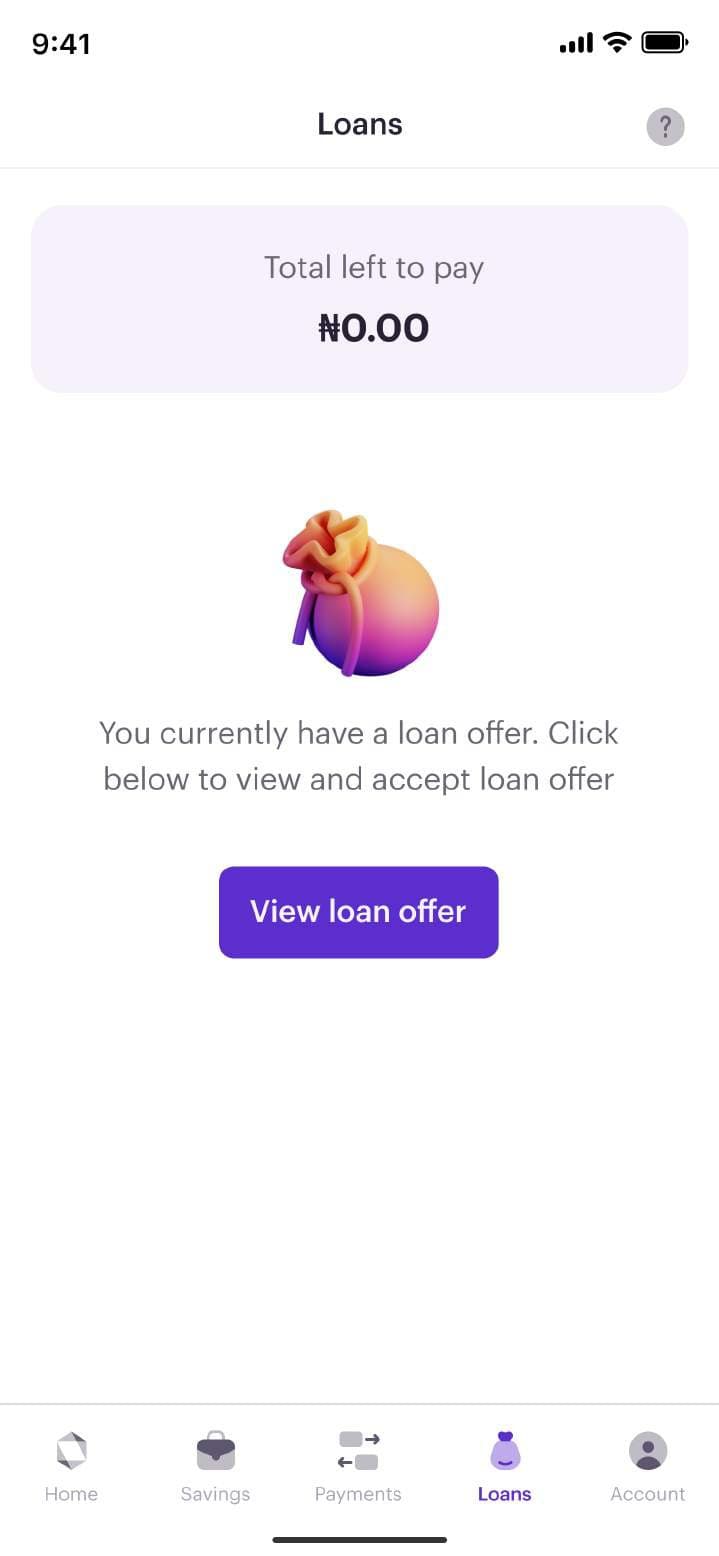
Dashboard prompting the customer to view their loan offer
An offer waiting, one tap away.
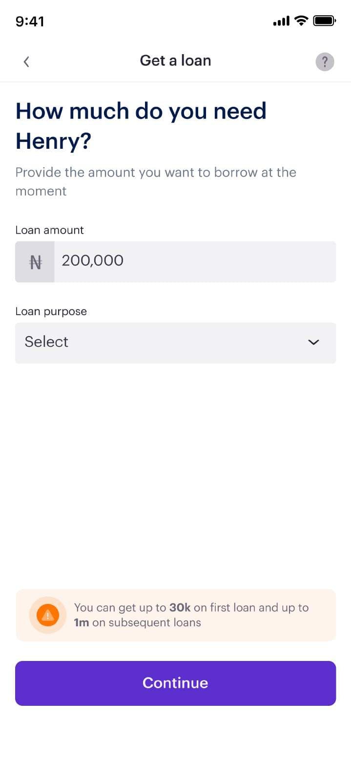
Get a loan screen asking how much the customer needs
One question per screen.
Loan offer with tenor, monthly payment and interest rate
The offer, explained plainly.
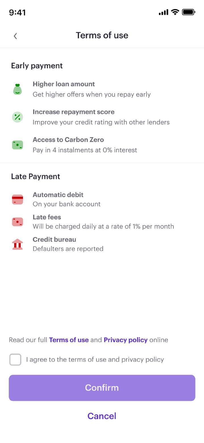
Terms of use summarising early and late payment rules
Benefits and penalties in plain words.
Select a bank account to share statements (details blurred)
Linking another bank’s statement.
Add bank statement form (details blurred)
Confirming the account to add.
Repay loan screen with next or full repayment options
Repay in full or in part.
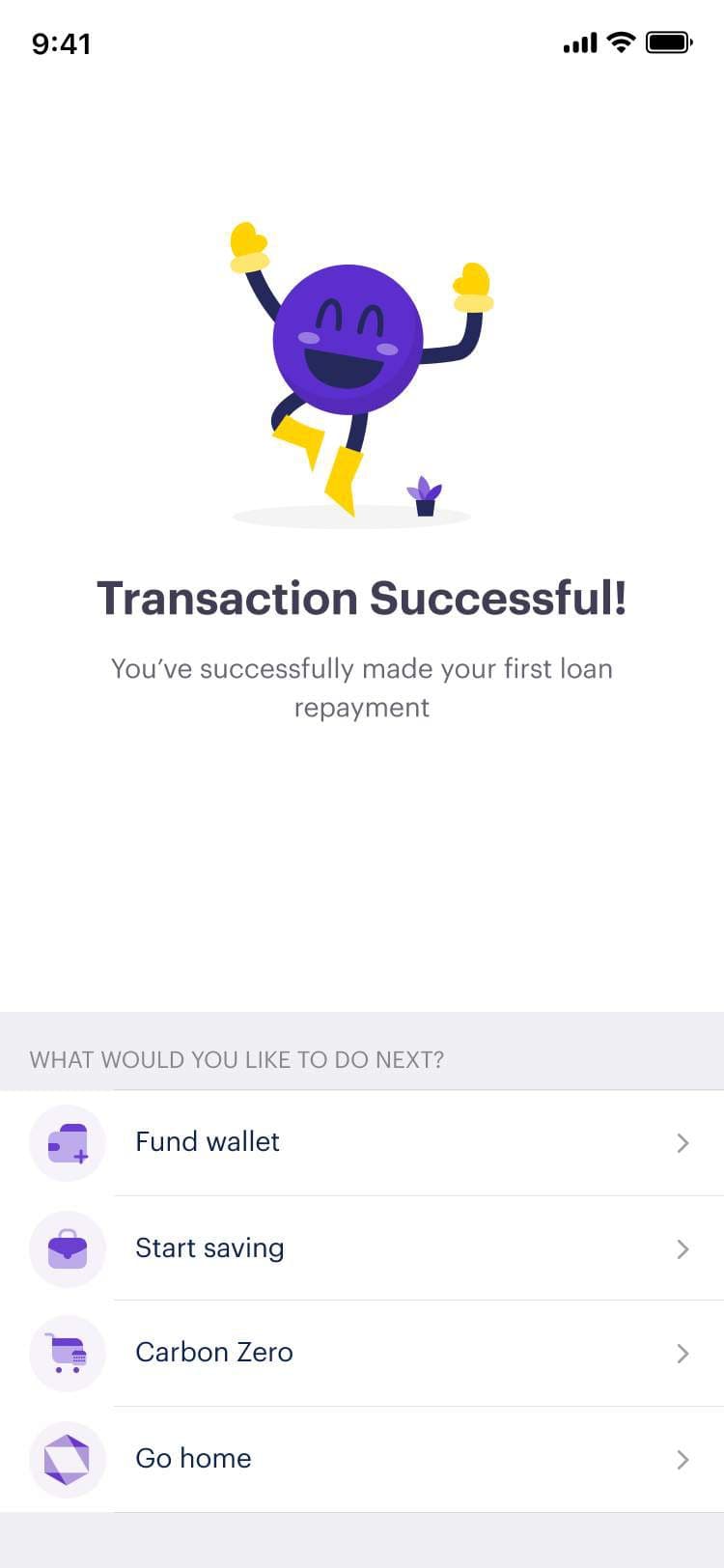
Repayment successful celebration screen
A moment worth celebrating.

Outcomes

Every target met or beaten, and better loans on the books.

  • New loan dashboard giving instant access to applications and history
  • Simpler application and offer flow with decline reasons and alternative offers
  • Bank statement linking from other banks to improve offer quality
  • Clear repayment with multiple funding options
  • Loan applications up 20%, beating the 15% target
  • Loan drop-offs down 10%, meeting the target
  • Non-performing loans down 10%
  • “He led the successful introduction of a design system into Carbon. He championed UI & UX improvements that energised our users while mentoring & developing a great design org.”
    Afiola Etomi, managed me at Carbon (LinkedIn recommendation)