Skip to content
All work

albert — Sustainability Platform

Rebuilt BAFTA albert’s carbon toolkit so productions record sustainability as they work, not after.

  • Senior Product Designer (contract)
  • Research to handoff
  • Web, mobile and admin tools
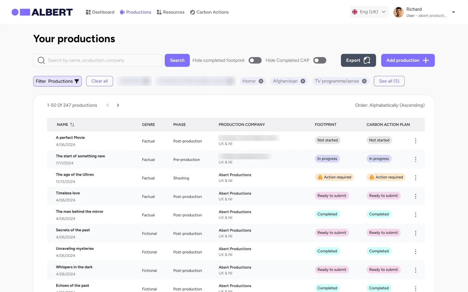
albert production list showing footprint and carbon action plan status for each production
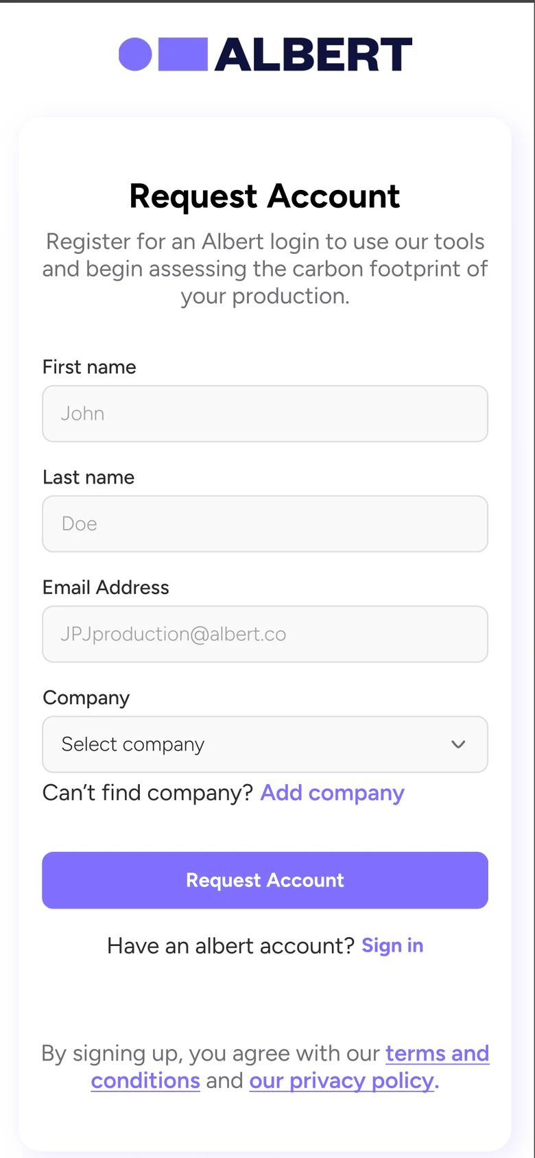
albert on a phone: request account form with visible labels and an add company option
The problem
Film and TV productions use albert to measure their carbon footprint and earn certification, but the toolkit was hard to navigate and hard to read, so teams left it until post-production and missed most of what they’d done.
What I did
I ran research with albert, production teams and broadcasters, then designed the next generation of the toolkit in two releases: first the journeys around the calculator, then the calculator, action plan and certification themselves, for every role that touches the data.
The result
A toolkit built around the people who hold the data: clear progress everywhere, bulk import, actions assigned to the crew who do them, and a lighter route to certification. Productions starting their footprint in pre-production rose from 30% to 55%, WCAG 2.2 AA criteria passed went from 60% to 85%, and satisfaction rose from 3.3 to 4.3 out of 5.
of productions now start their footprint in pre-production, up from 30%
55%
of WCAG 2.2 AA criteria passed, up from 60%
85%
satisfaction from production companies, up from 3.3 (+30%)
4.3/5
research sessions, one with ~30 people
~10
Company
BAFTA albert (contract)
Role
Senior Product Designer
Team
Product manager, product owner, engineering lead, 2 developers
Timeline
Jul 2024 – Aug 2025
Platform
Web app, mobile web, admin tools

Problem & context

The industry’s carbon toolkit was asking busy productions to remember everything at the end.

albert is the screen industry’s sustainability organisation, backed by BAFTA. Productions use its toolkit to calculate their carbon footprint, complete a Carbon Action Plan and earn certification, and some broadcasters require it.

albert was building the next generation of its toolkit, and the experience had to change with it. It needed to work for production assistants entering data, managers signing it off, assessors reviewing evidence, territory partners managing companies and broadcasters following their productions.

Constraints

  • A live tool used across UK film and TV, so changes had to land in stages
  • The footprint calculator was too large to rebuild in the first release
  • Under NDA: real productions, companies and figures are blurred or replaced with sample data

Role & team

I owned design across research, flows and UI in a team of six.

  • That’s me

    Chukwuemeka Iheonye

    Senior Product Designer

    Research, accessibility audit, journeys for every role, interaction and UI design, edge cases and handoff.

  • Richard Faderin

    Product Manager

    Priorities, roadmap and research sessions with albert and its users.

  • Product & engineering

    Product owner, engineering lead, 2 developers

    Requirements, architecture and build.

Research & insights

The people with access to albert weren’t the people with the details.

Richard and I ran around 10 remote sessions with the albert team, production users and broadcasters including the BBC, Netflix, Channel 5 and ITV. One session brought together around 30 people to map the bottlenecks. We asked how productions capture sustainability work, who does what, and when: in pre-production, on location, in the studio and in post. The themes below are summarised from my notes.

  1. 01

    Access and knowledge live with different people

    The people with logins weren’t the people who knew what was actually done. That detail sat with crews, departments and finance.

  2. 02

    Hard to use means left until the end

    Because the toolkit was difficult to navigate, teams put it off until post-production, by which point most actions and evidence were lost.

  3. 03

    The evidence already exists, in receipts

    Invoices and receipts are the natural record of a production, but there was no way to add or bulk-upload them.

  4. 04

    It has to work on the go

    The questionnaire needed to be simple enough to answer as things happen, not reconstructed months later.

Process

Audit, listen, map every role, then ship in two steps.

  1. 01

    Audit

    A WCAG accessibility audit of the live toolkit, screen by screen.

  2. 02

    Listen

    Remote sessions with albert, production teams and broadcasters, including walkthroughs of the assessor tools.

  3. 03

    Map every role

    Journeys for production users, managers, finance, assessors, territory partners and broadcasters.

  4. 04

    Ship V1

    Fix the journeys around the calculator first: accounts, company admin, productions and the action plan.

  5. 05

    Design V2

    Rebuild the calculator, action plan and certification, add Carbon Actions, reports and mobile onboarding.

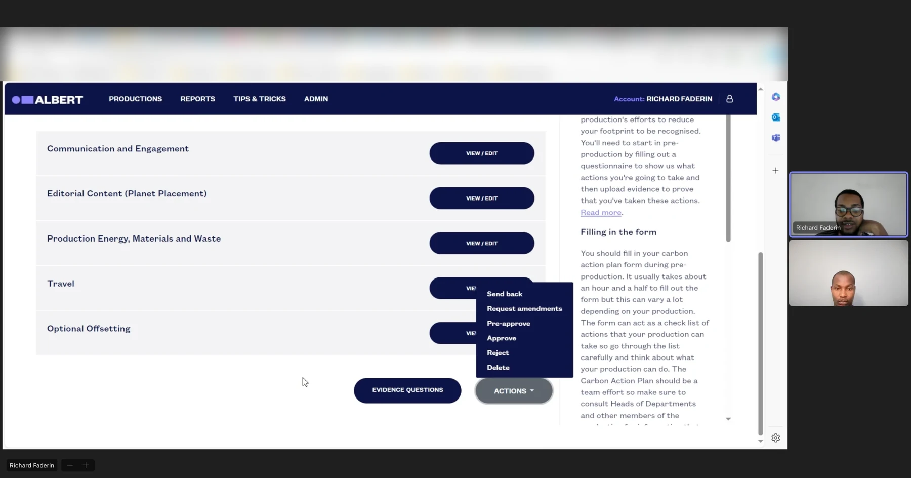
Remote research session reviewing the assessor workflow in the old toolkit, with two participants on video
A research session with Richard, walking through the assessor tools in the old toolkit.
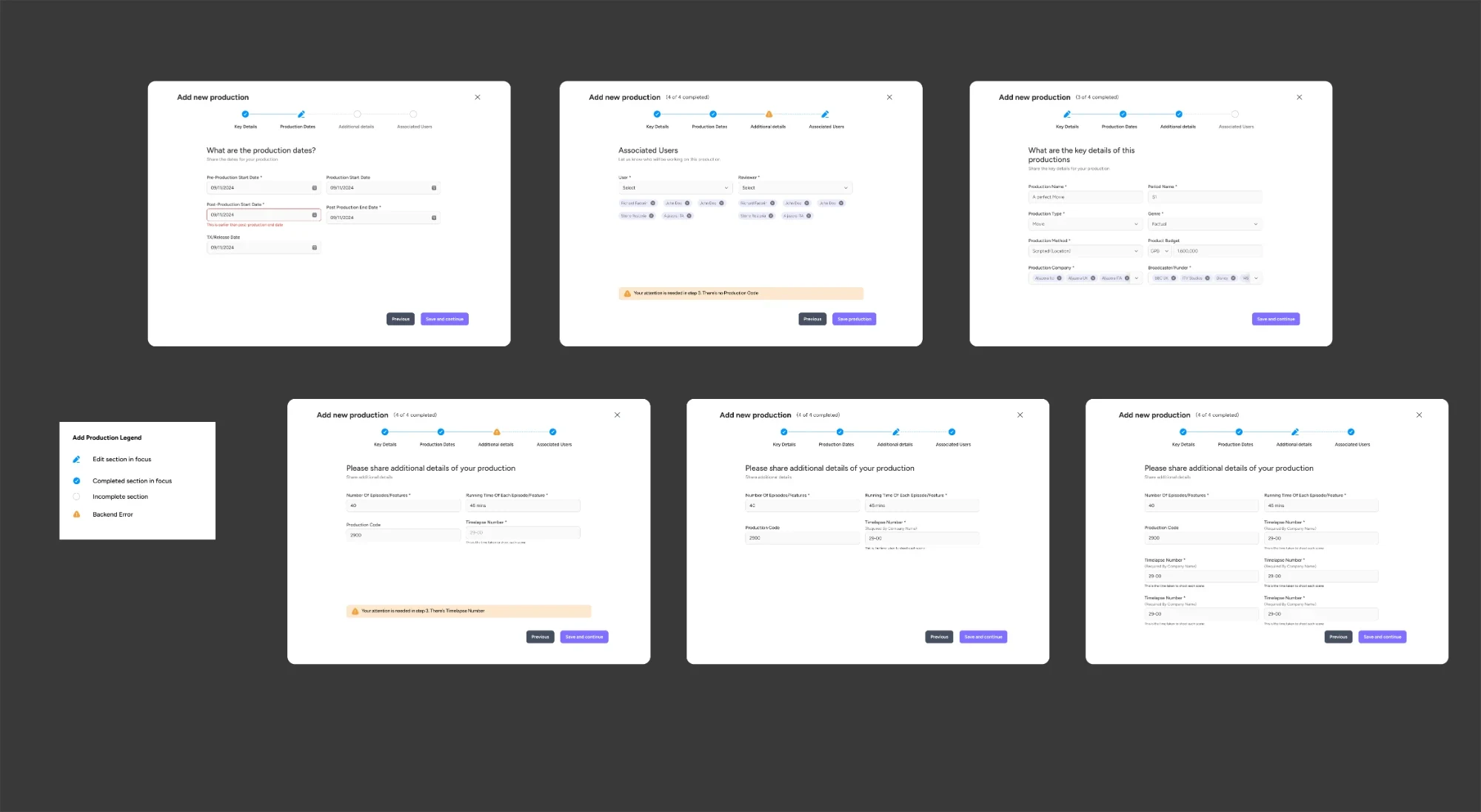
Six states of the add production flow with a legend for editing, complete, incomplete and server error
Every state designed, including errors that point to the exact step to fix.
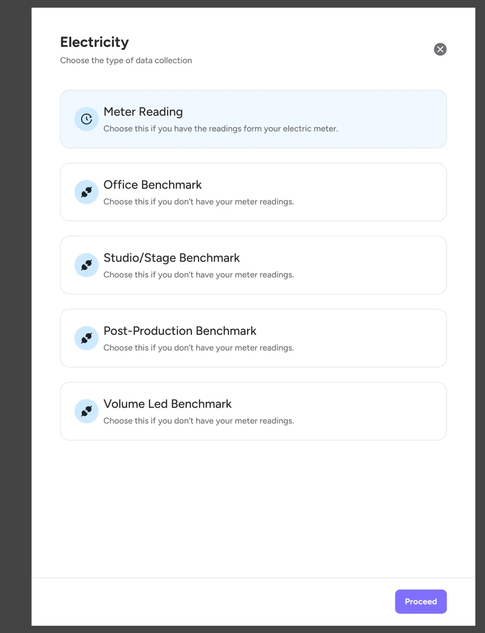
Electricity data collection choices: meter reading or office, studio, post-production and volume LED benchmarks
No meter readings? Pick a benchmark and log something honest now.
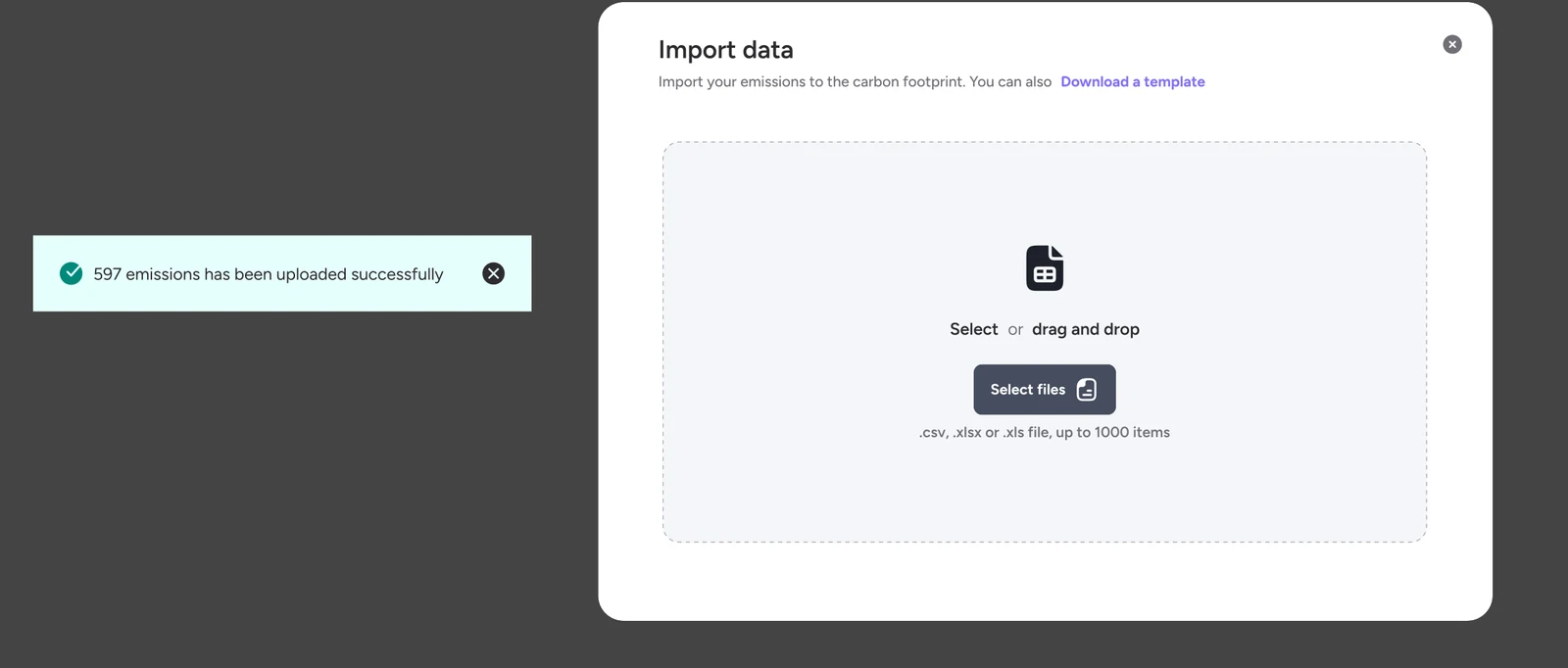
Import data dialog accepting CSV or Excel files up to 1,000 rows, with a success message for 597 emissions
Bulk import from the spreadsheets finance teams already keep.

Key decisions

Seven decisions, each traced to something we heard.

  1. Decision 01

    Fix the journey before the engine

    The footprint calculator was the biggest and riskiest part of the toolkit.

    Options considered

    • Rebuild everything at once
    • Ship the journeys around it first
    What we chose
    V1 left the calculator alone and fixed what surrounds it: sign-up, company admin, productions and the action plan. V2 then rebuilt the calculator.
    Why
    Productions got improvements sooner, and we learned from V1 before tackling the hardest part.
    The trade-off
    The calculator kept its old experience until V2.
  2. Decision 02

    Show status everywhere

    Nobody could tell what was done, late or blocked until it was too late.

    What we chose
    Footprint and action plan status side by side for every production, and answered counts on every theme.
    Why
    If people can see what’s outstanding during production, they deal with it during production.
  3. Decision 03

    Assign actions to the people who do them

    The person with the login wasn’t the person doing the work.

    What we chose
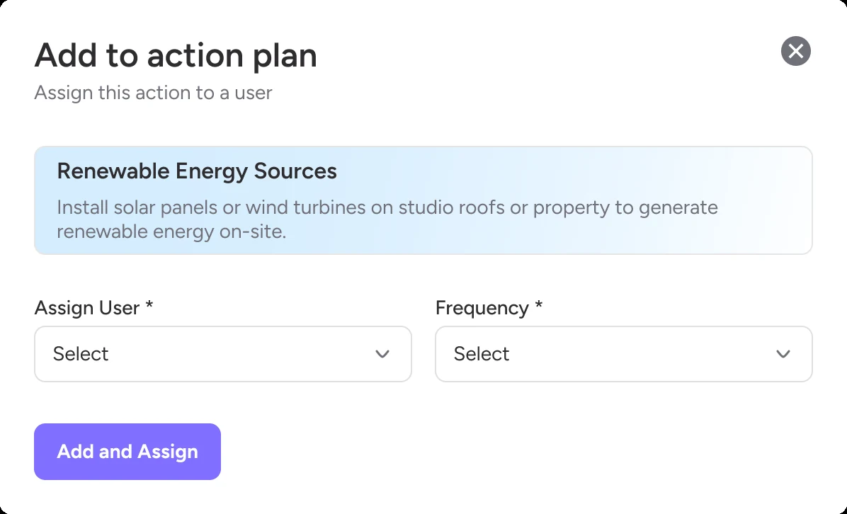
    Any suggested action can be added to the plan, assigned to a named person and given a frequency, then tracked in Carbon Actions.
    Why
    Recording moves to the crew member who knows the detail, while it’s fresh.
  4. Decision 04

    Meet people in their spreadsheets

    Receipts and invoices already held the evidence, but couldn’t be added.

    What we chose
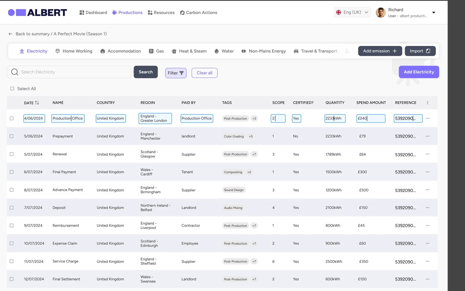
    A spreadsheet-style table with inline editing, plus import of CSV or Excel files with up to 1,000 rows and a template.
    Why
    Finance and coordinators can bring data in the format they already use.
  5. Decision 05

    Break the calculator into small flows

    One long calculator was the main reason people put it off.

    What we chose
    Pick a category, choose how you’ll measure it, fill a short form. Benchmarks cover anything without meter readings.
    Why
    Each entry takes minutes, so it can be done as the production happens.
  6. Decision 06

    Two routes to certification

    The full process put smaller productions off before they started.

    What we chose
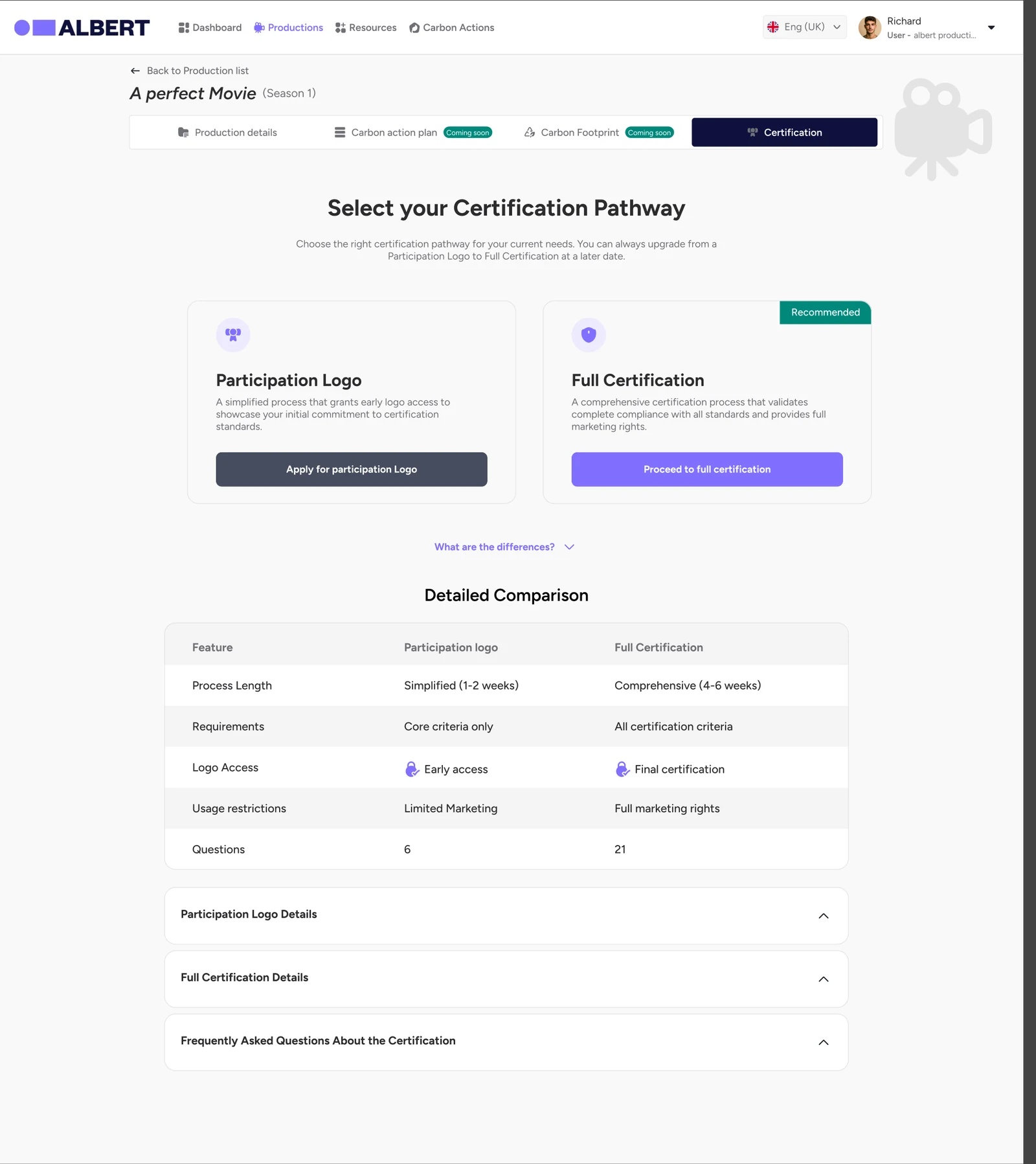
    A Participation Logo (6 questions, 1–2 weeks) alongside Full Certification (21 questions, 4–6 weeks), with a clear comparison and the option to upgrade.
    Why
    It lowers the barrier to starting, while the full route stays rigorous.
  7. Decision 07

    Catch errors where they happen

    The old toolkit accepted dates out of order, which skewed everything after.

    What we chose
    Inline validation on every field, a dates timeline that makes order obvious, and errors that name the step to fix.
    Why
    Bad data is cheaper to prevent than to audit.

How V1 evolved

From a form at the end to a tool used throughout.

  1. Before

    Remember it all later

    Long pages of text, faint status and no progress. Most productions filled it in after wrapping.

  2. Research

    Find the real bottleneck

    Sessions with albert, productions and broadcasters showed access and knowledge sat with different people.

  3. V1

    Fix the journey

    Accounts with two-factor sign-in, company admin, a production list with status, validated set-up and a progress-led action plan.

  4. V2

    Rebuild the core

    A calculator in small flows with bulk import, assignable carbon actions, two certification routes, reports and mobile onboarding.

Before

Where we started: dense, faint and easy to put off.

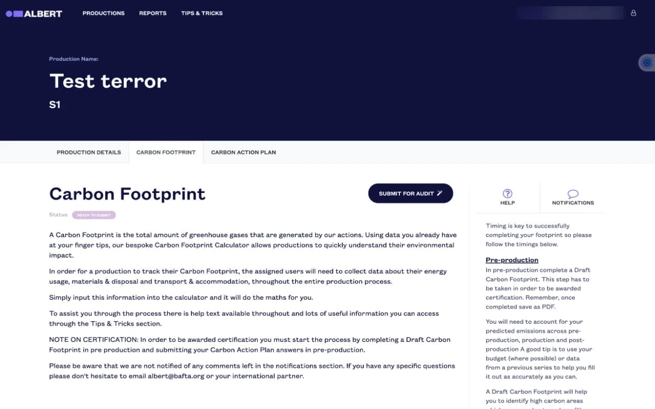
  • Old carbon footprint page with six paragraphs of text and faint labels
    Six paragraphs before any data, and labels at about 2:1 contrast.
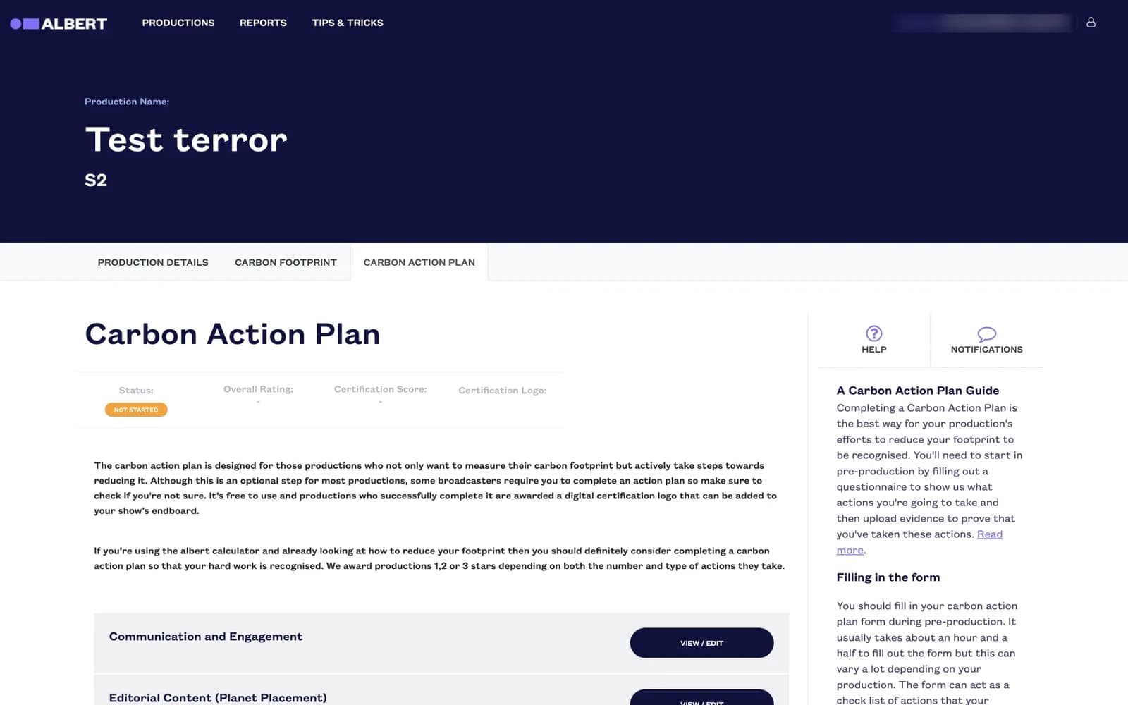
  • Old carbon action plan with five identical View/Edit buttons
    Five identical buttons and no sense of progress.
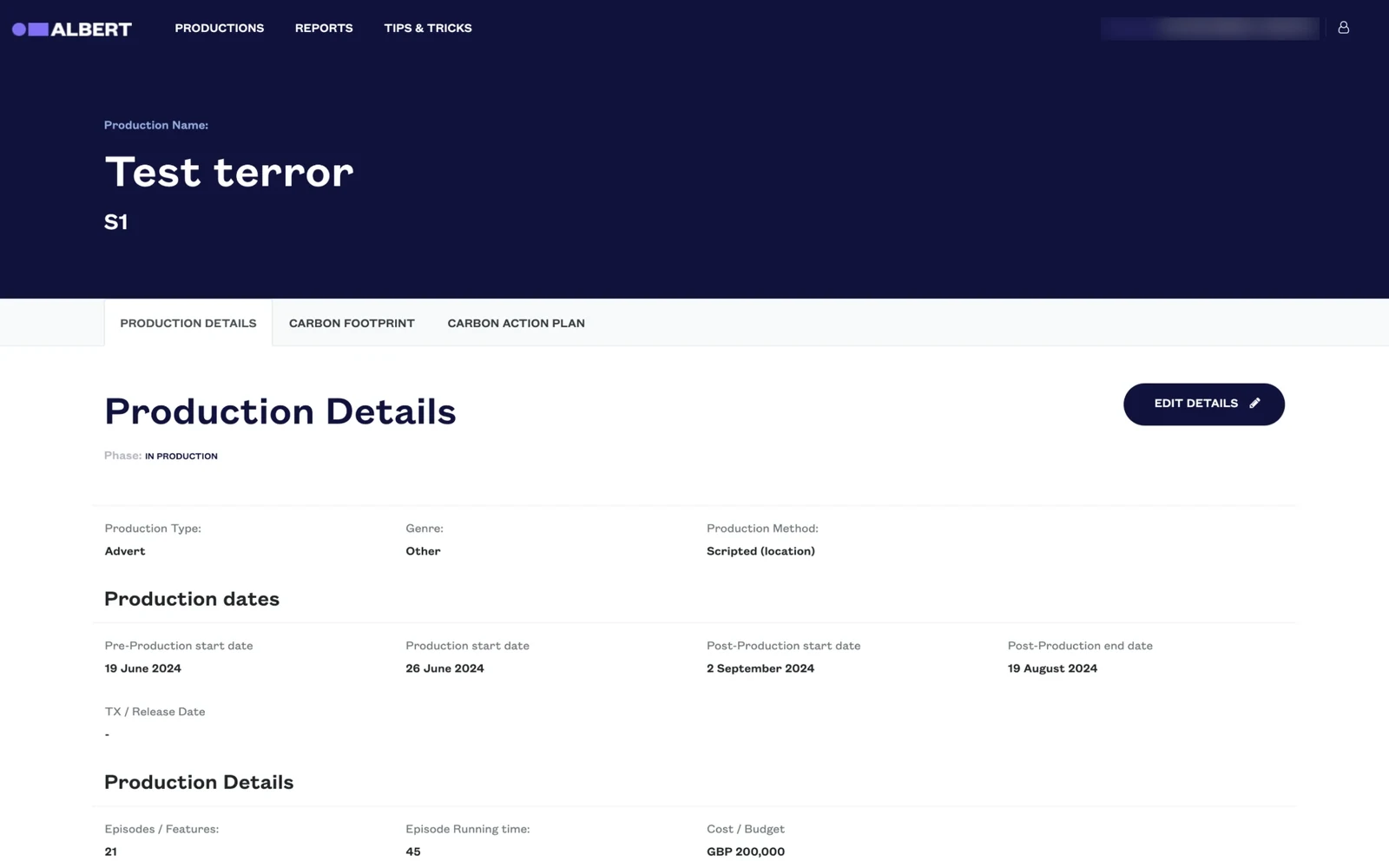
  • Old production details page
    Dates accepted in the wrong order, and faint phase labels.
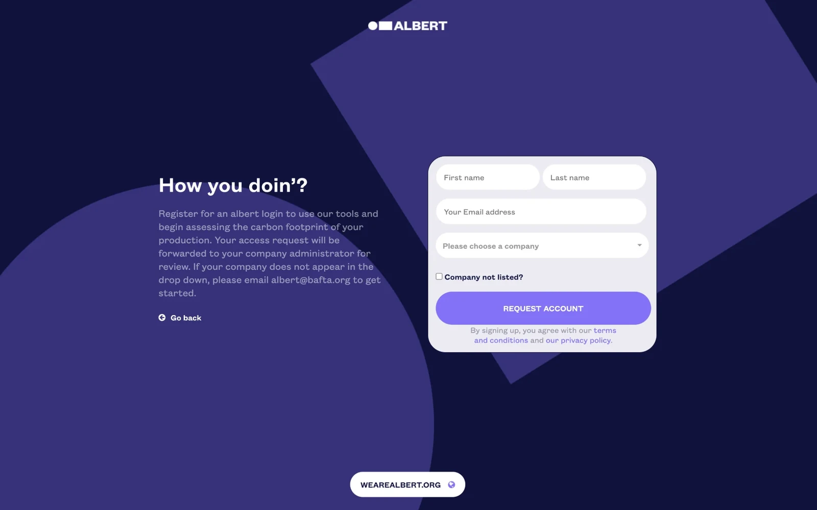
  • Old request account page with placeholder-only fields
    Fields with no visible labels, and text over shifting backgrounds.

Mobile

Getting in, on any device.

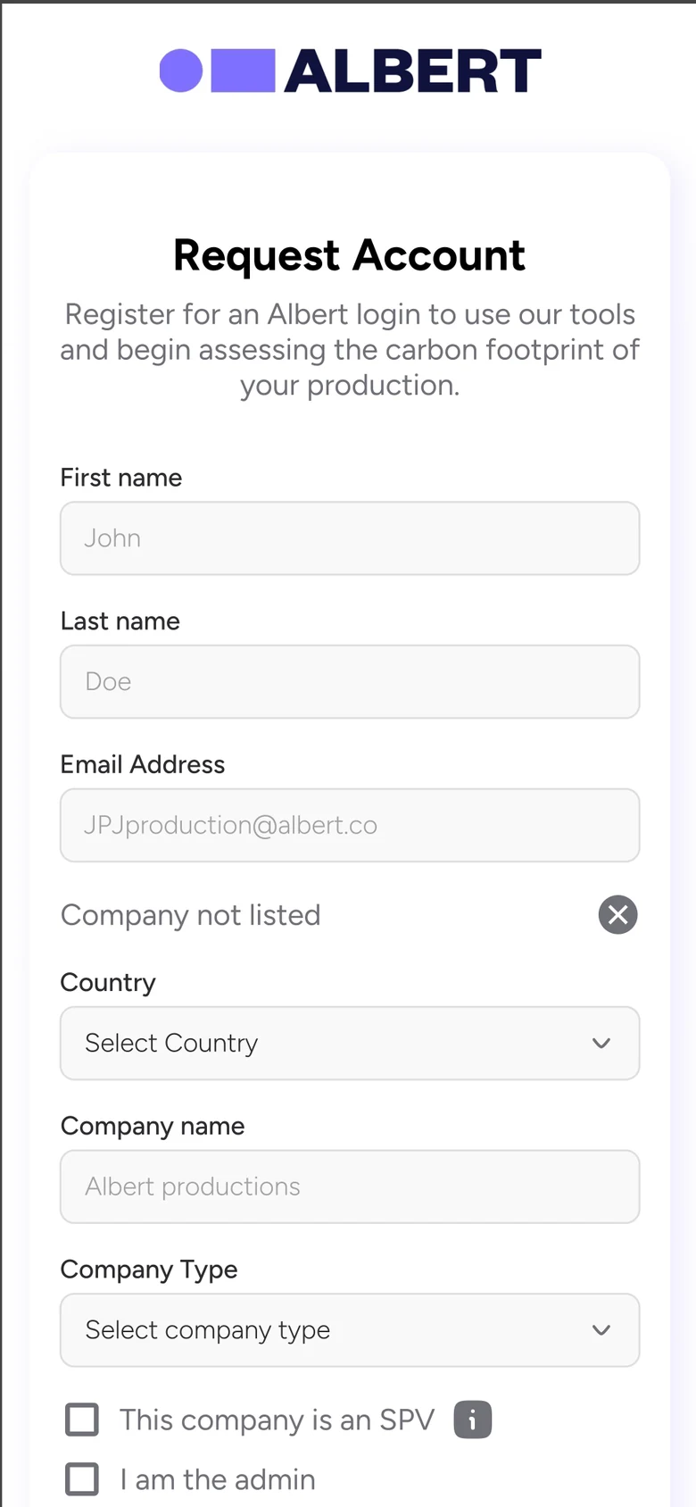
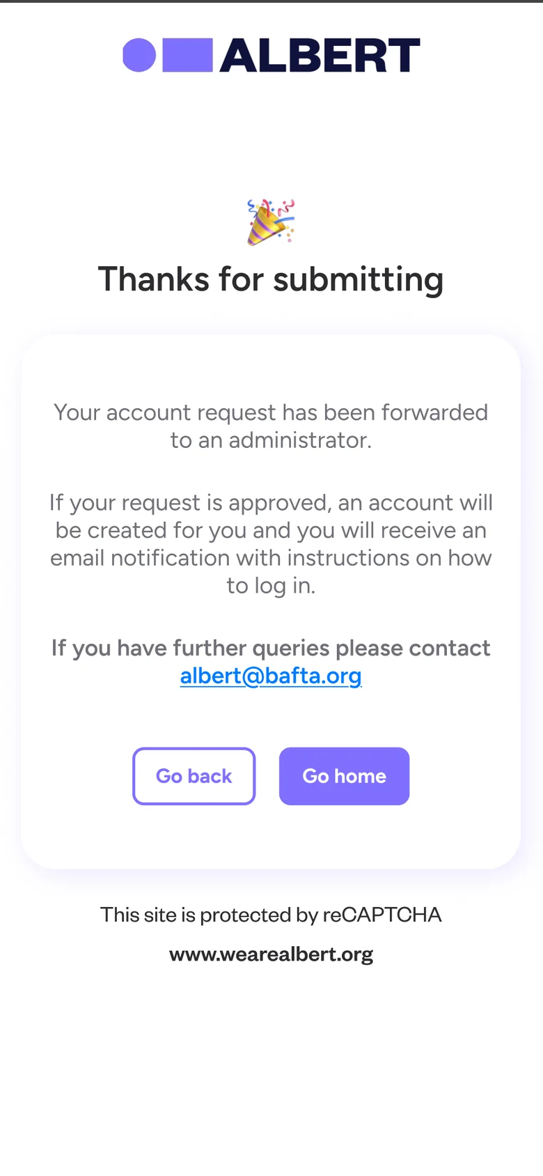
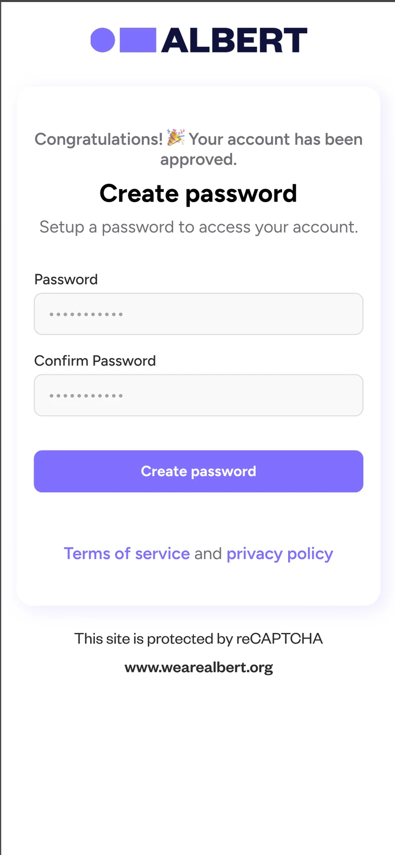
V2 made onboarding work on a phone, with a clear path when your company isn’t listed and a message at every step about what happens next.

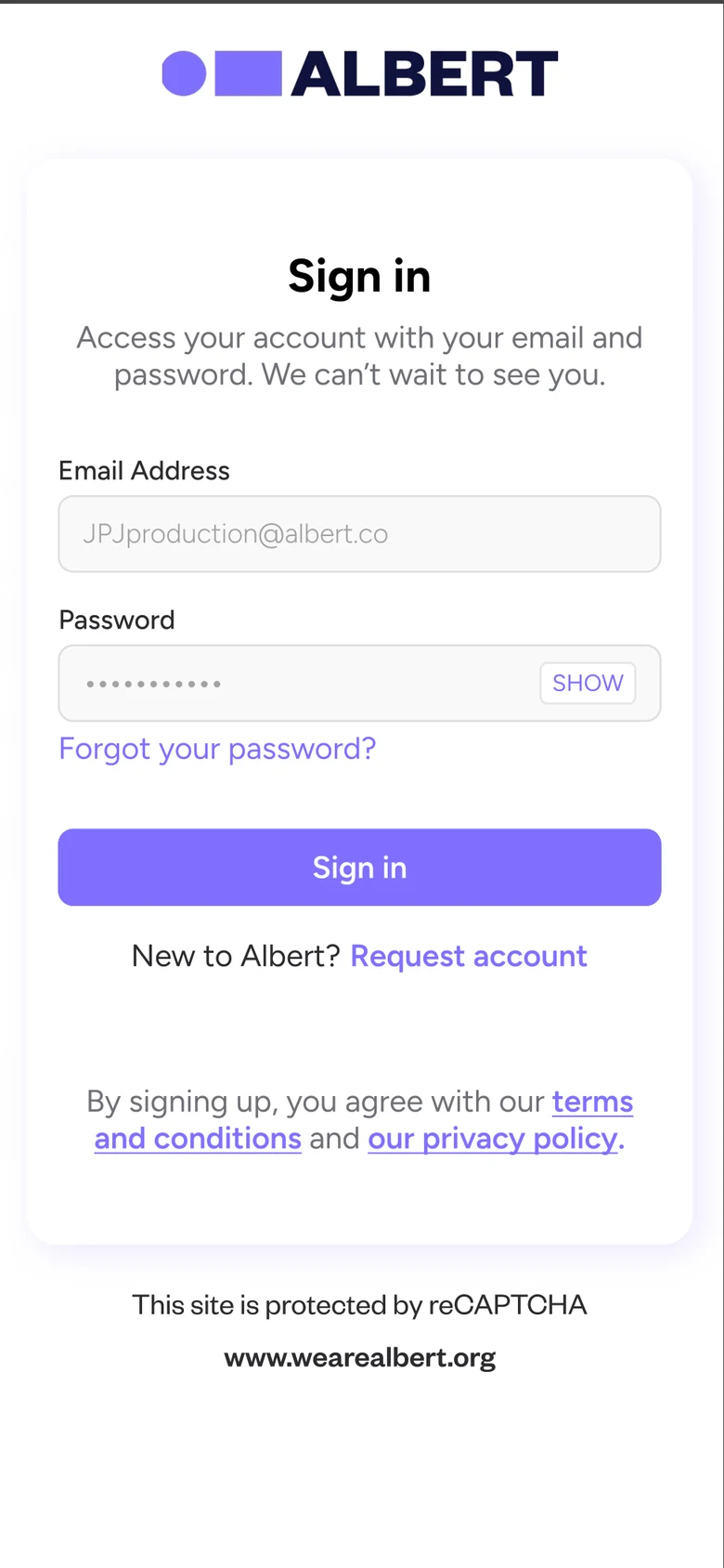
Sign in screen
Sign in.
Request account form with labelled fields
Labelled fields, and ‘Add company’ if yours is missing.
Company not listed form with country, company type and SPV option
Register a new company without emailing anyone.
Thanks for submitting screen explaining the approval step
What happens next, in plain words.
Create password screen after approval
Approved, then straight into a password.
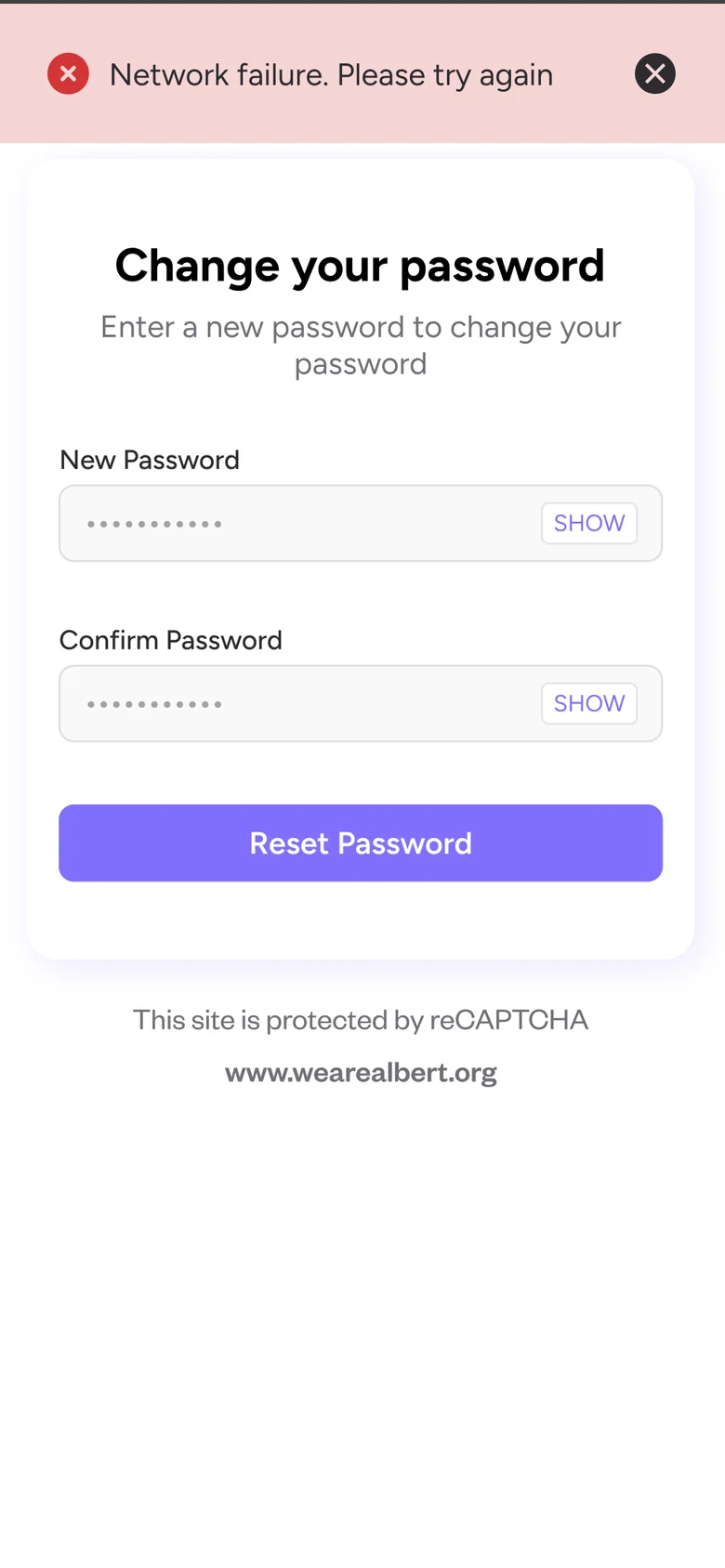
Change password screen with a network failure banner
Errors say what went wrong and what to do.
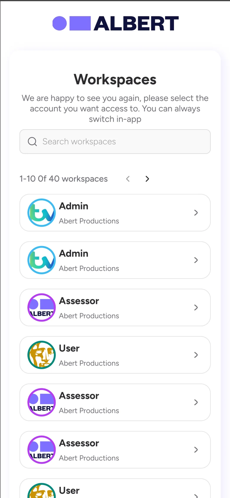
Workspace switcher listing roles across companies
One login, many roles: switch workspace in one tap.

Web

One toolkit, a view for every role.

Production list with footprint and action plan status per production
V1: every production’s footprint and action plan status at a glance.
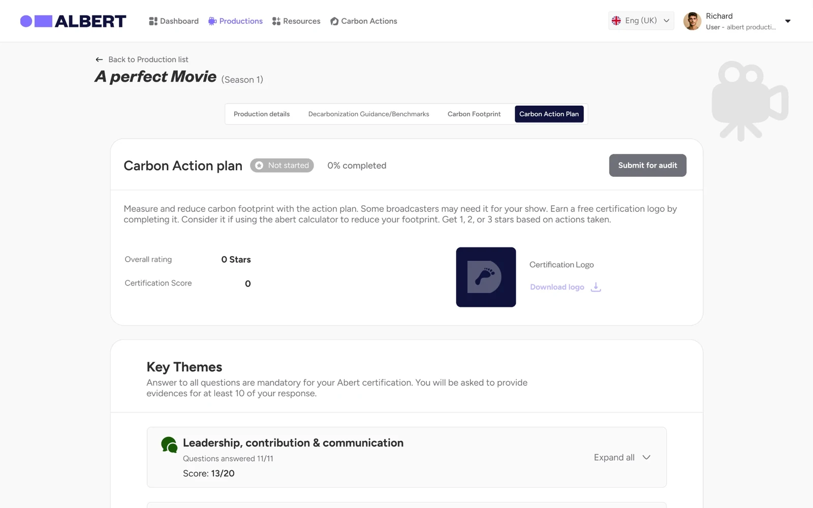
Carbon action plan with progress and themes
V1: progress, scores and themes instead of five blank buttons.
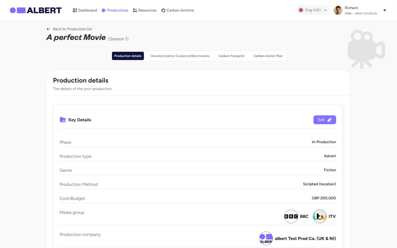
Production details in grouped cards
V1: details grouped into cards, each with its own edit.
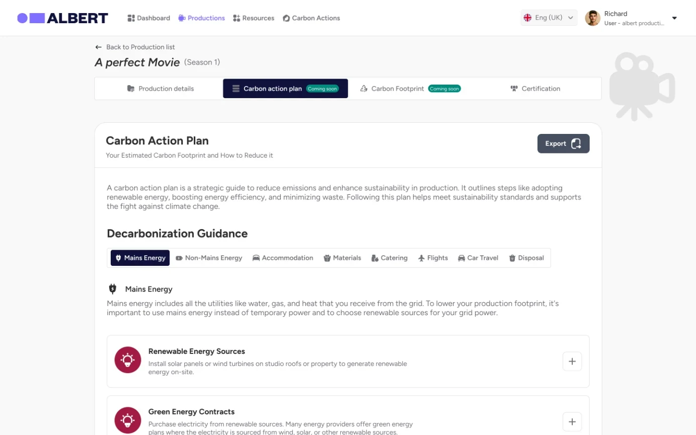
Decarbonisation guidance by category with actions to add
V2: guidance by category, one tap to add an action.
Add to action plan dialog with assign user and frequency
V2: assign each action to a person, on a schedule.
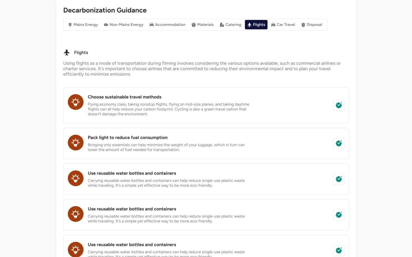
Flights guidance with added actions ticked
V2: added actions are ticked off in place.
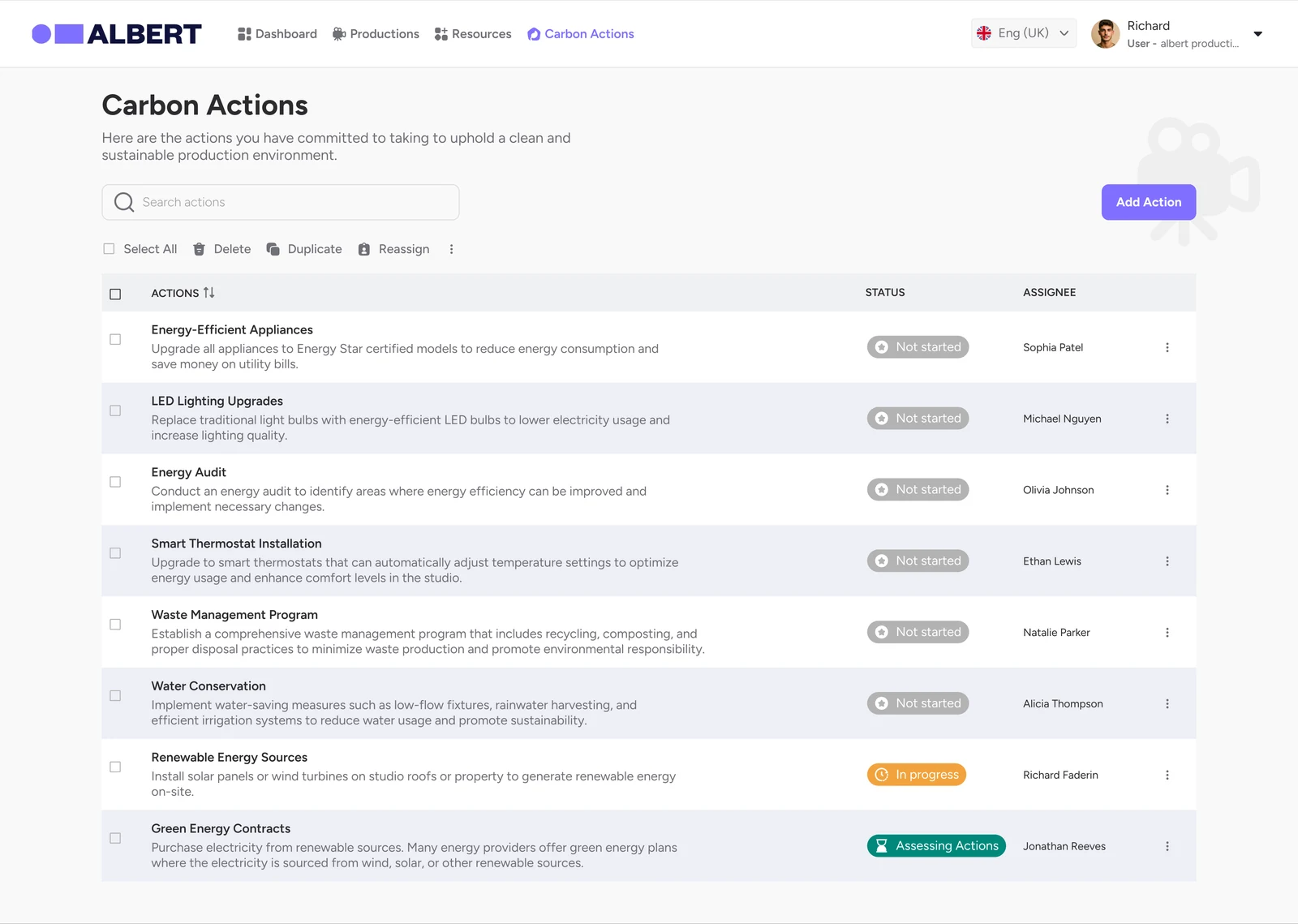
Carbon actions list with status and assignee for each action
V2: Carbon Actions shows who owns what.
Electricity entries in an editable table with filters
V2: footprint entries in an editable, filterable table.
Choose between participation logo and full certification with a comparison table
V2: two certification routes, compared side by side.
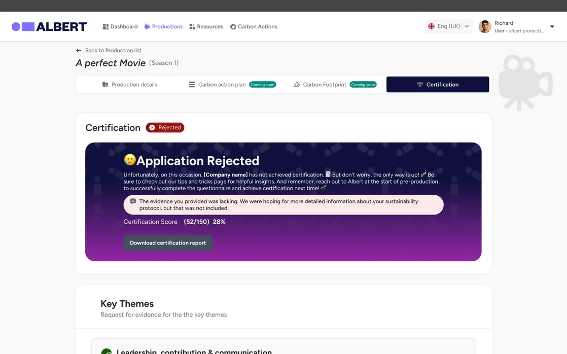
Certification result with evidence and assessor feedback for each answer
V2: assessor feedback next to each piece of evidence.
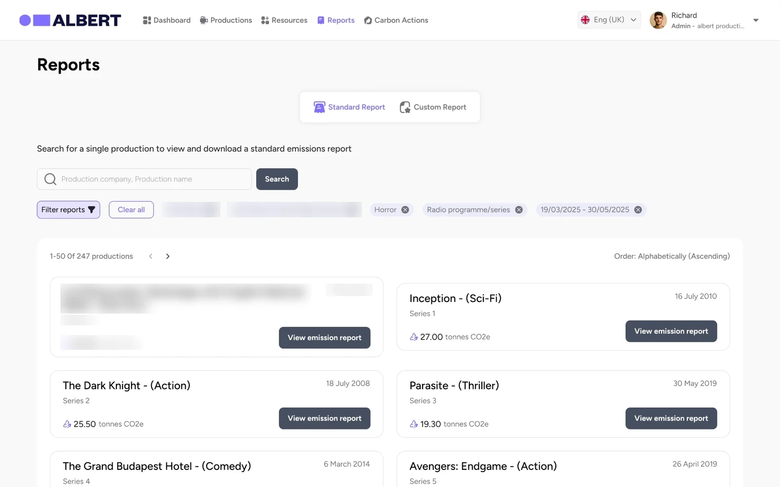
Reports list with emissions per production (real data blurred)
V2: standard and custom reports. Real productions blurred.

Accessibility

Accessibility drove the redesign, not a final check.

What we built in

  • Visible labels on every field

    Placeholder-only inputs were replaced with persistent labels and helper text.

  • Status never relies on colour

    Every status pairs text with colour, and warnings add an icon.

  • Errors you can act on

    Messages appear next to the field, say what’s wrong and point to the step to fix.

  • Plain language and progress

    Dense paragraphs became short guidance, with progress shown on every task to reduce cognitive load.

  • Predictable structure

    The same production tabs, headings and actions across every module.

What my audit found, and the fix

  • The brand purple is too light for small white text

    #806FFF with white text measures 3.7:1, below AA. A darker shade such as #5F4BE8 (5.7:1) would pass for buttons and links, keeping the lighter tint for decoration.

  • Some status badges still need contrast work

    Lighter badges such as ‘Not started’ need darker text or backgrounds to pass AA.

Outcomes

Productions now start earlier, and were eager to use it.

  • Productions starting their footprint in pre-production rose from 30% to 55%, the problem our research set out to solve
  • WCAG 2.2 AA criteria passed rose from 60% to 85% on our accessibility audit
  • Average satisfaction among production companies rose from 3.3 to 4.3 out of 5 (+30%), and they were keen to move to the redesign
  • V1: accounts with two-factor sign-in, company admin, production list and set-up, and a progress-led action plan
  • V2: calculator flows with bulk import, assignable carbon actions, two certification routes, reports and mobile onboarding
  • Role-specific views for production teams, assessors, territory partners and broadcasters

Reflection & next

What I’d tell myself on day one.

  1. 01Design for the person holding the receipt, not the person holding the login.
  2. 02Shipping the journey before the engine bought trust and taught us what the calculator really needed.
  3. 03An accessibility audit at the start is a design brief, not a list of bugs.
  4. 04Check brand colours against WCAG before the first component. Fixing contrast later touches everything.

Coming next

What comes next

Keep measuring how early productions start, plus data completeness and certification rates as V2 rolls out, and darken the primary colour so every button and badge passes AA.